

Responsive Health Insurance Portal
BCBSM wants to demystify health insurance for their members by rethinking their current digital experience. Specifically, they want to create an online portal that feels personalized, accessible, and supportive of their diverse members’ needs.
My role
Co-Design Lead responsible for:
Early-stage research
Remote brainstorm facilitating
Competitive auditing
Navigation + search structuring
Wireframing
Prototyping
Client delivery
The Challenge
Our client challenged us to consider the following:
Personalize the health insurance experience in a way that compares with disruptors in the healthcare space (e.g. Oscar Health, One Medical, Clover)
Prioritize features that support members’ needs and align with internal funding and development schedules.
Consider the omni-channel and multi-app experience for diverse member types.
Discovery
Health insurance is complicated. What are members actually looking for?
BCBSM wants to understand what people need when it comes to health insurance. I designed and distributed a survey to a diverse audience of health insurance users. These results informed sprint planning and helped create client alignment across segments of BCBSM’s business.
82%
Respondents who say their most important use case is checking if a service is covered.
2-3x
Number of times members log into their account annually to check for something.
3
Recurring pain points among survey respondents: finding care, finding costs, and paying a claim.
Design
We worked fast. Remote, 1-week sprints kept us on schedule and the client engaged.
Guided by the findings from our research, we dove into three, 1-week sprints. I structured a sprint timeline prioritizing features around finding care (checking services, reviewing accumulations), getting care (wellness, smart chat) and managing care (reviewing and paying for claims) . I infused principles of the Google’s remote sprint guide into the sprint structure:
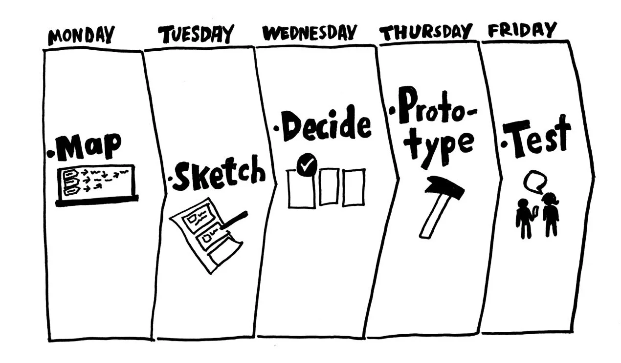
Google’s remote design sprint follows a 5-day model. We leveraged remote-friendly software including Miro, Figma, and Dropbox.
A screen shot from one of our remote brainstorm sessions. These cross disciplinary sessions generated input from across the organization.
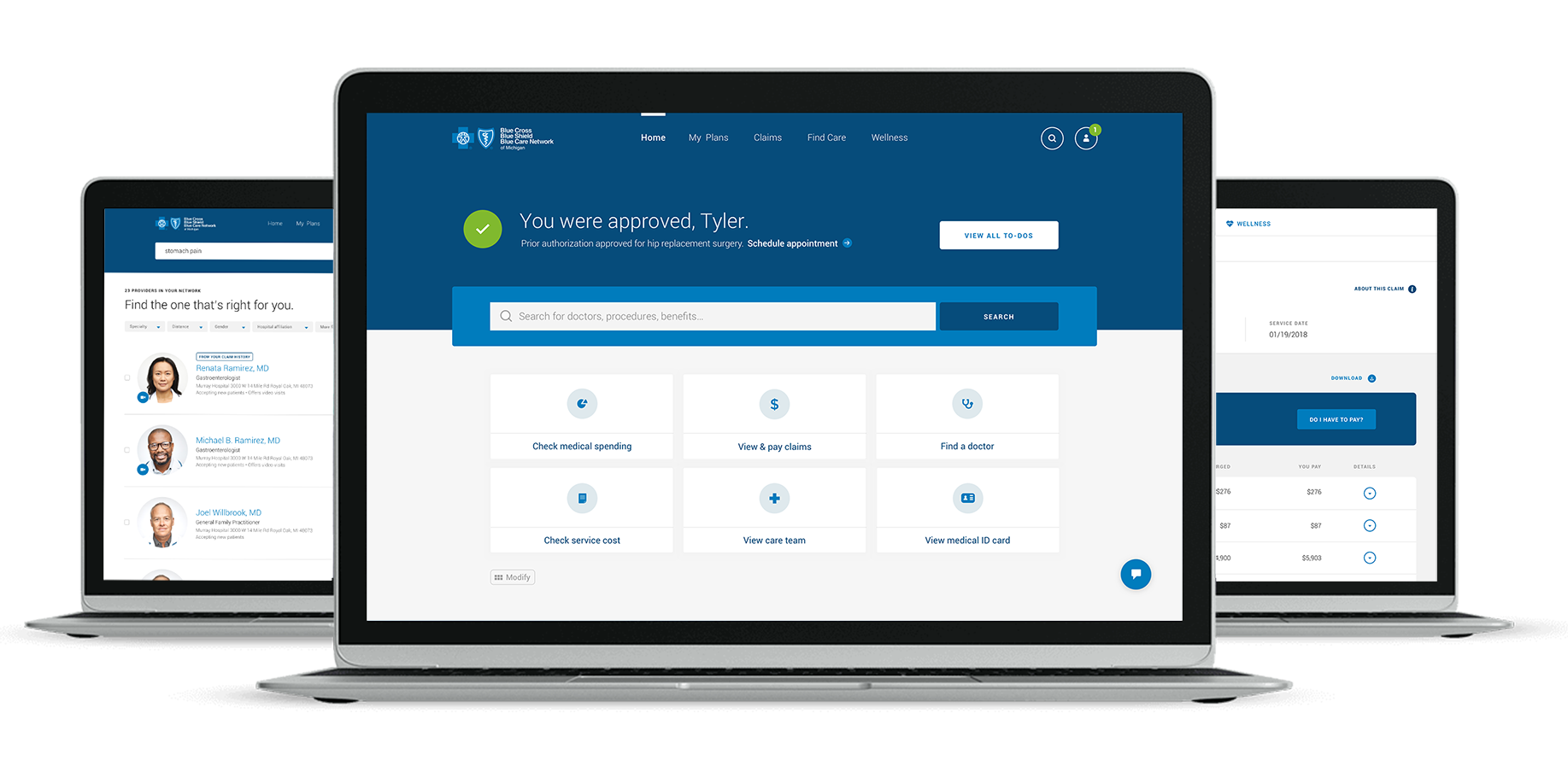
Perfecting navigation was crucial to the member experience.
Navigation and search became the backbone of our responsive member portal to account for dense content and the necessity for navigability.
We explored both vertical and horizontal navigation options for global navigation. While vertical navigation felt more modern and “portal-like,” it came at the expense of space.
Considering content quantity, we settled on a traditional horizontal nav.
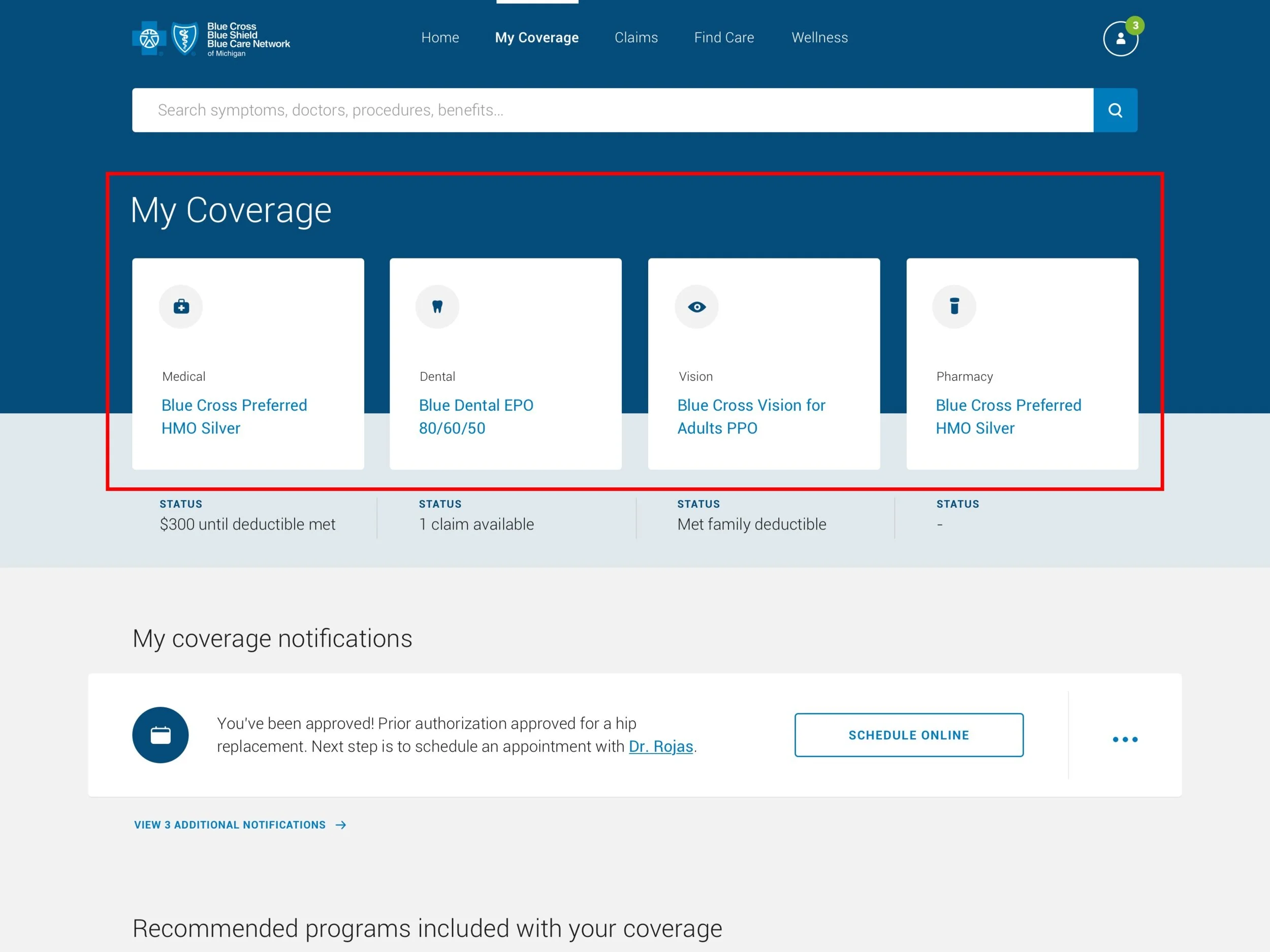
Global navigation leads to landing pages which serve as scannable section overviews. These pages require an additional layer of navigation.
Navigation tiles were easily responsive components that also provided a glimpse of deeper content without the need to drill down.
The third layer of navigation needed to support the most content, yet. We decided on horizontal tabs to account for long scrolling pages.
Horizontal tabs do not, unfortunately, translate to mobile as seamlessly. We decided on a traditional drop down to change page content.
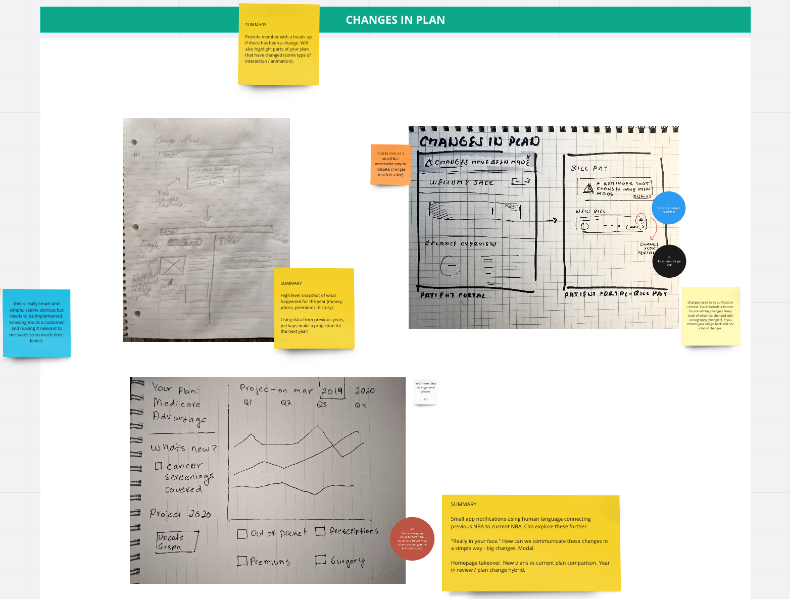
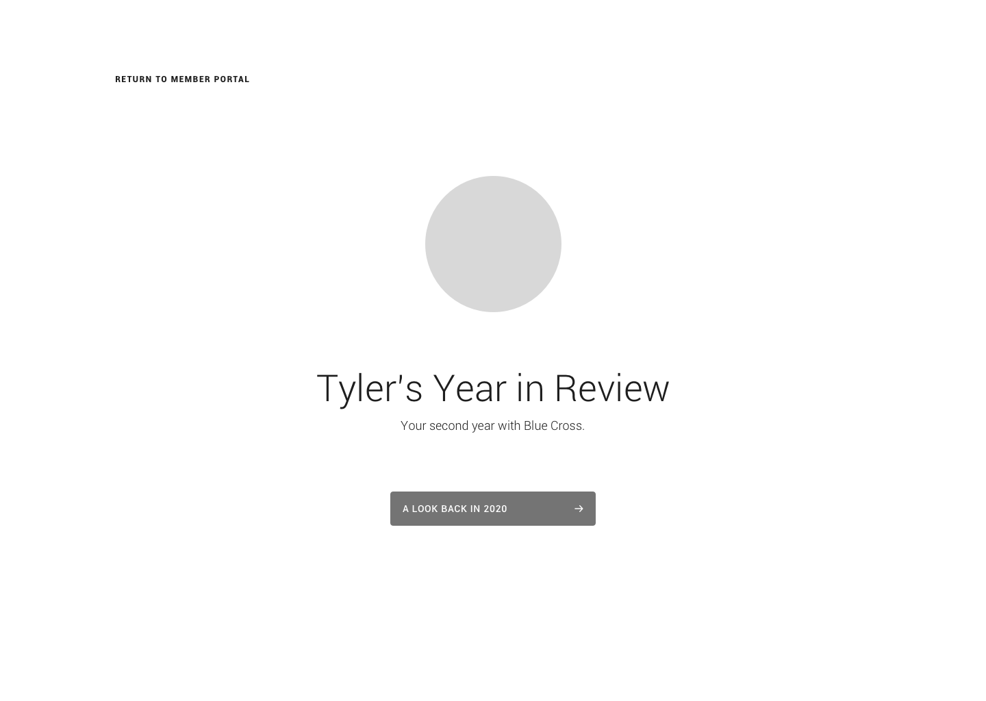
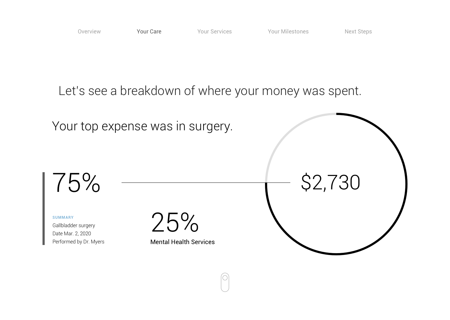
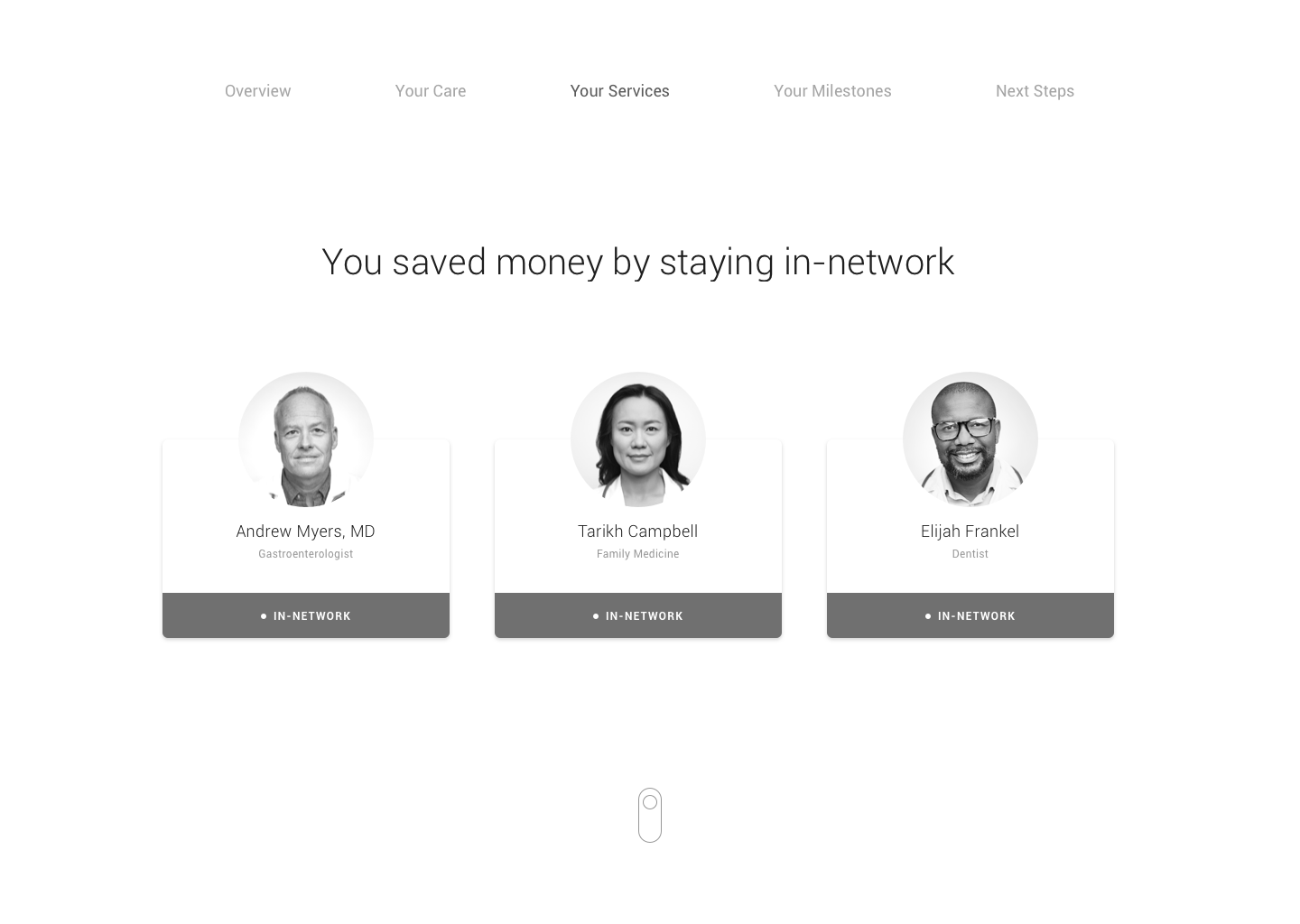
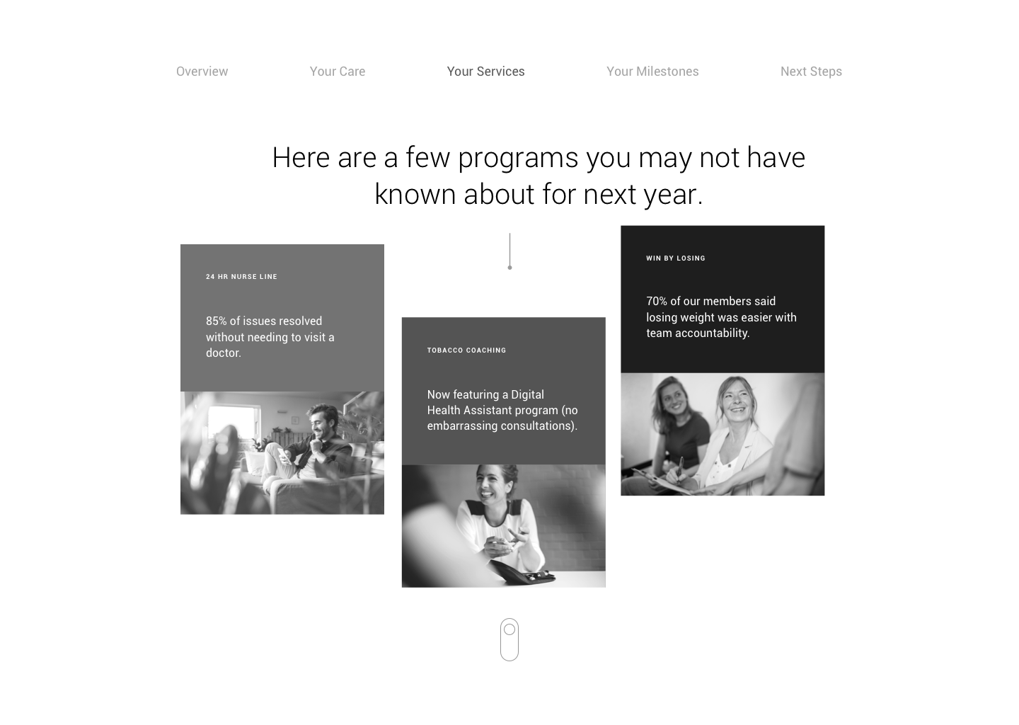
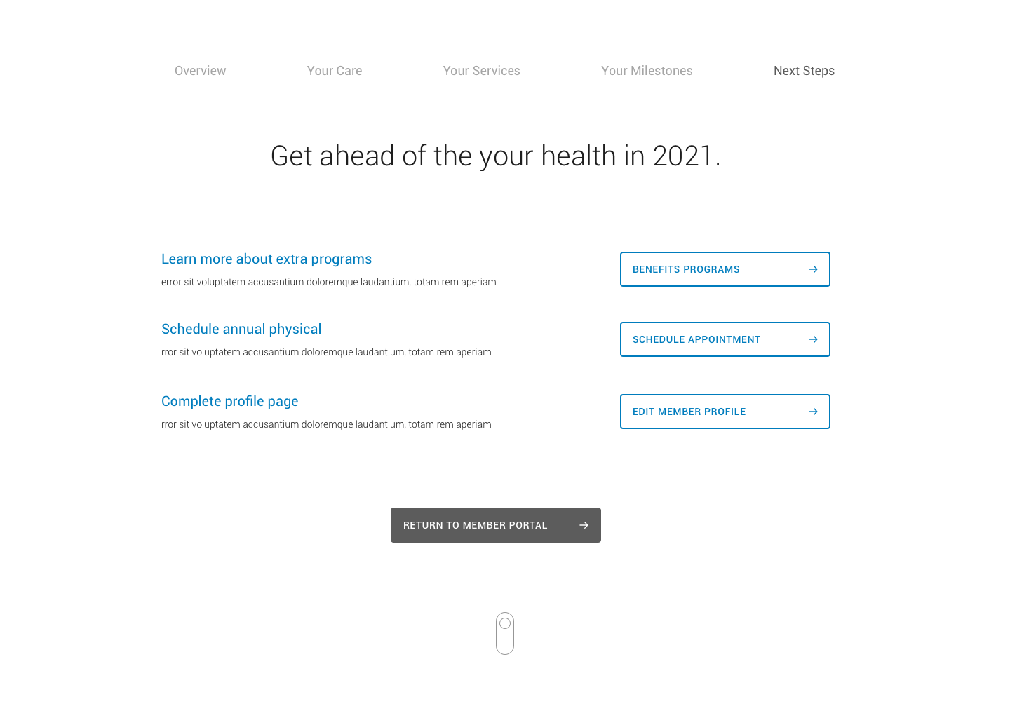
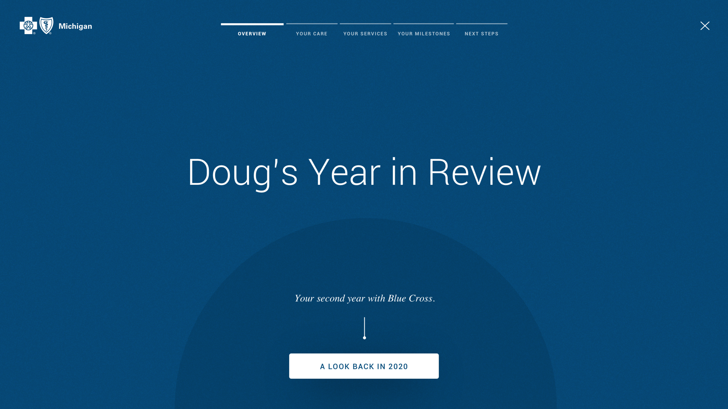
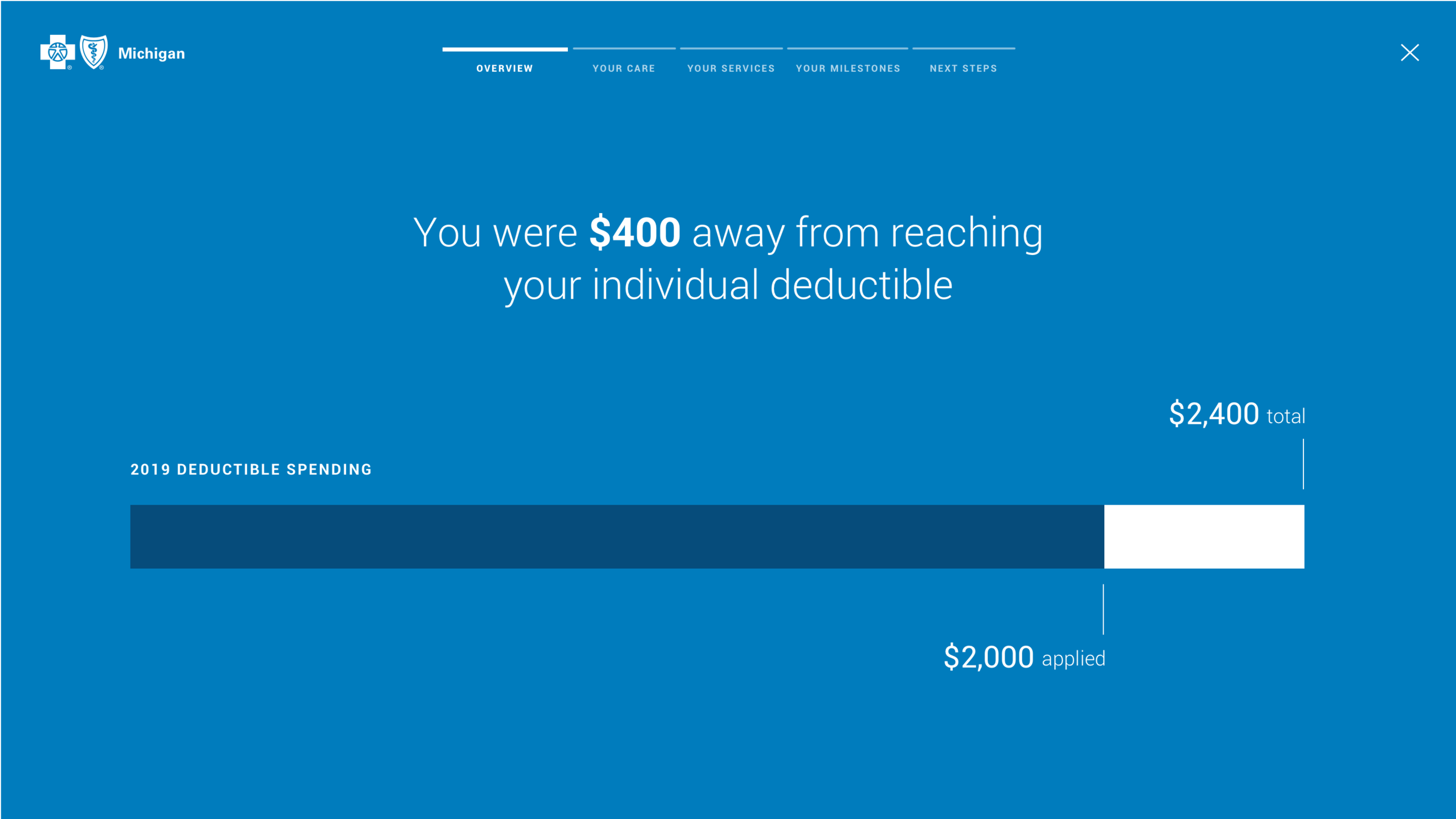
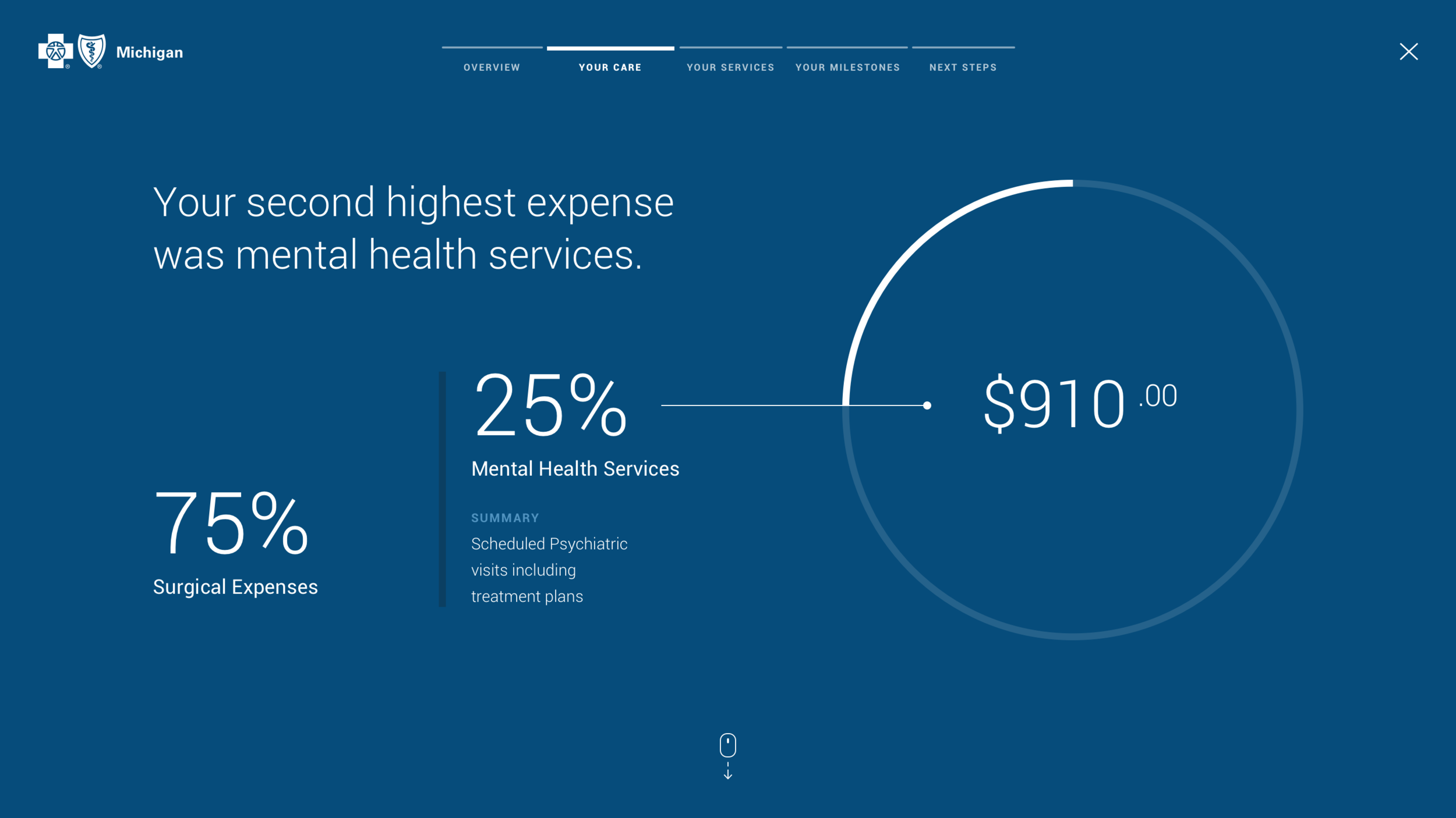
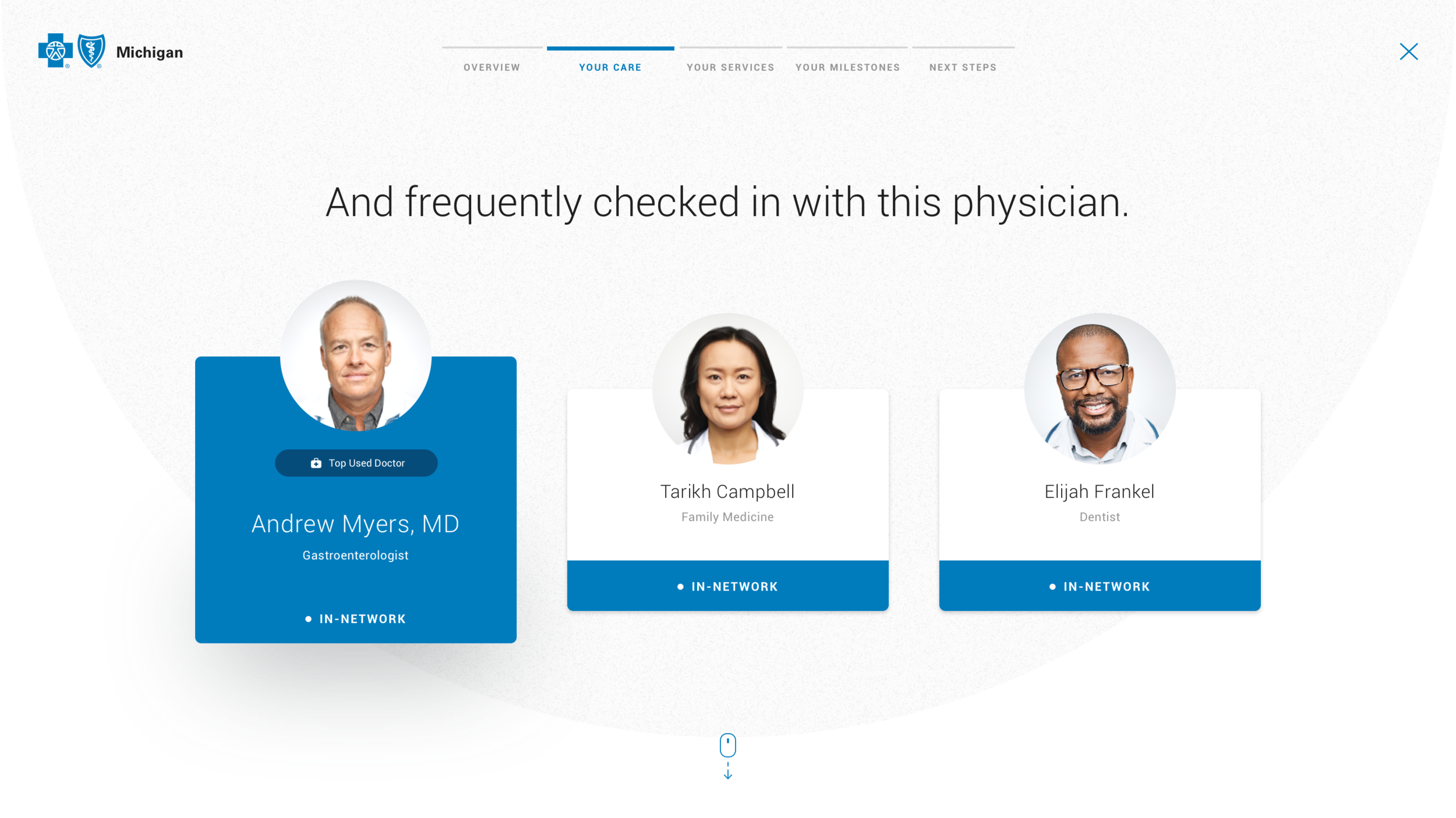
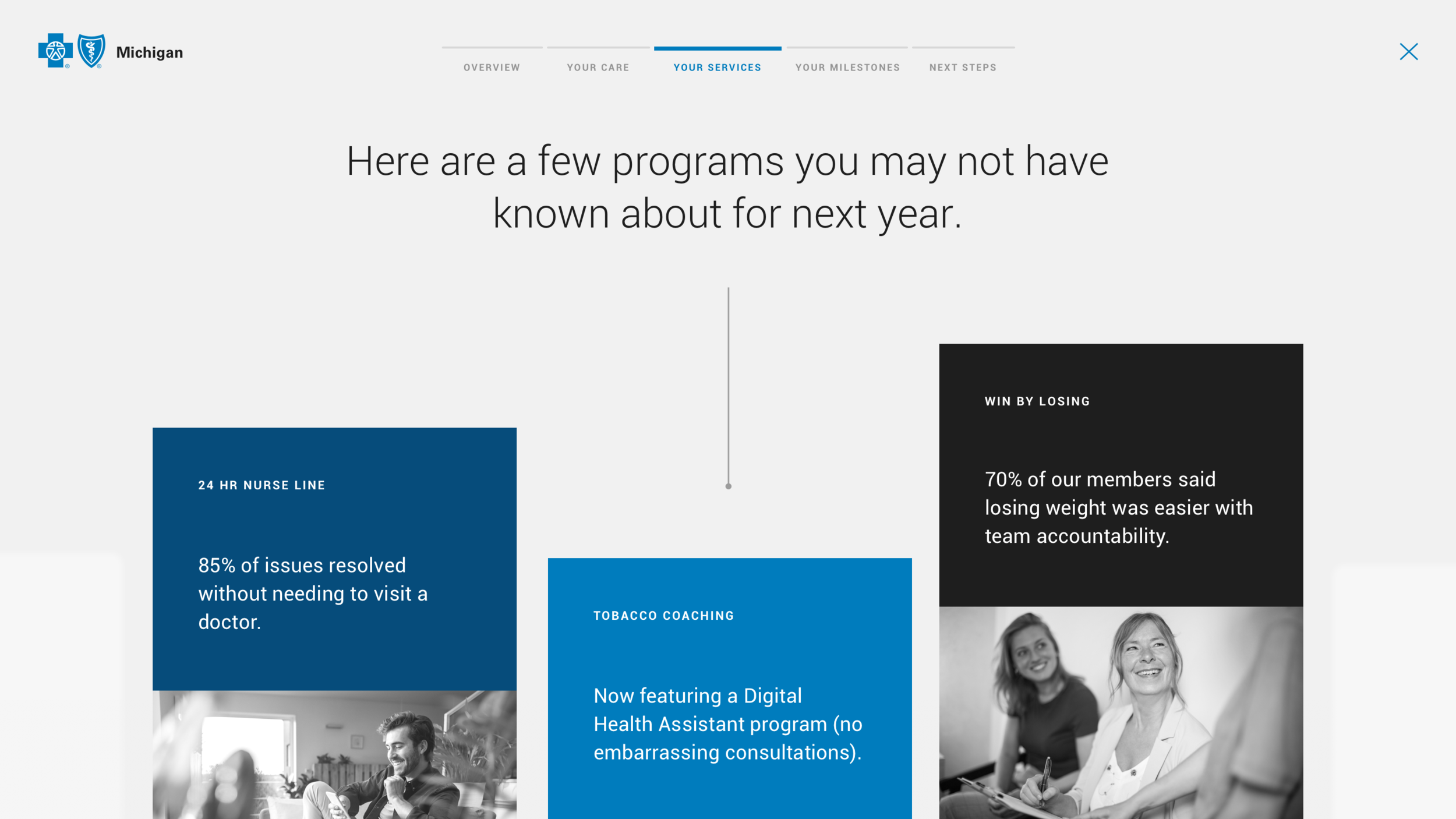
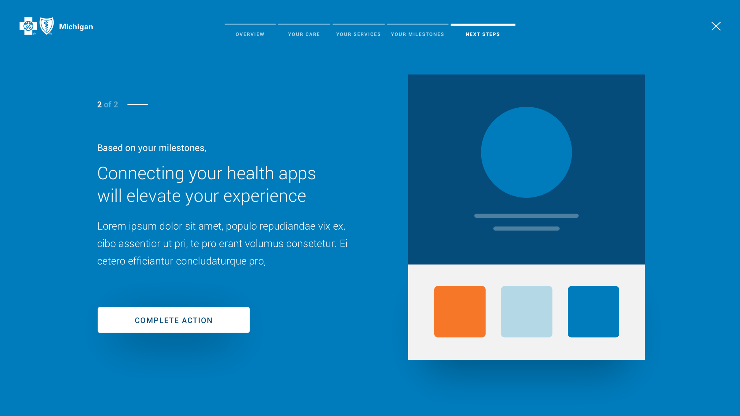
How do we infuse personalization into health insurance?
Despite the obvious paradox, BCBSM was searching for innovative ways to make the health insurance experience feel personal. I spearheaded a concept called “Year in Review,” which would pull data from members’ health profiles and surface a lightweight, animated summary of their healthcare usage. The Year in Review would end with actionable insights in preparation for the coming year.

Final mocks were created in collaboration with a designated visual designer.
Deliver
BCBSM is joining fellow healthcare disruptors in rethinking the way that health insurance is perceived. Our thoughtful, methodical approach to the problem enabled our team to deliver a responsive member portal that does exactly that.
Personalized solutions - I found opportunities to personalize the experience from suggested healthcare choices based on location, to animated summaries of a member’s care.
Ease of navigation - I devised a navigation structure that could support dense content across platforms and enable members to scan and find what they need.
3rd-party integration (content pending) - I helped provide strategy recommendations for the client about when it seemed appropriate to partner with others who have perfected desired features (health tracking, scheduling, etc.).