
Bone-Adjustment Tracking App
iSpatial is a mobile app that pairs with external fixators, medical devices helping to realign bones disfigured by trauma, or genetic inheritance. Specifically, the app helps patients track and monitor their progress as they make device adjustments.
My role
Design Lead responsible for:
Early-stage research
Concept sketching
Wireframing
Usability testing
User interface design
Branding + Style guide development
The Challenge
Our client challenged us to consider the following:
How might we make a burdensome, often painful experience less intrusive?
How might we make an experience that is approachable for patients, and also care-givers, operating the device on behalf of others.
How can we streamline various workflows, including making an adjustment, recording notes, and collecting other clinician-facing information?
Discovery
How might we make a burdensome experience feel less intrusive?
Though our client had completed some early-stage research, they sought a more holistic understanding of their users, and the market. Beyond that, they wanted to understand how a digital solution might affect the emotional experience of their users.
I organized a variety of UX activities to expand our baseline knowledge of the product, the space and our users.
Product mock-up
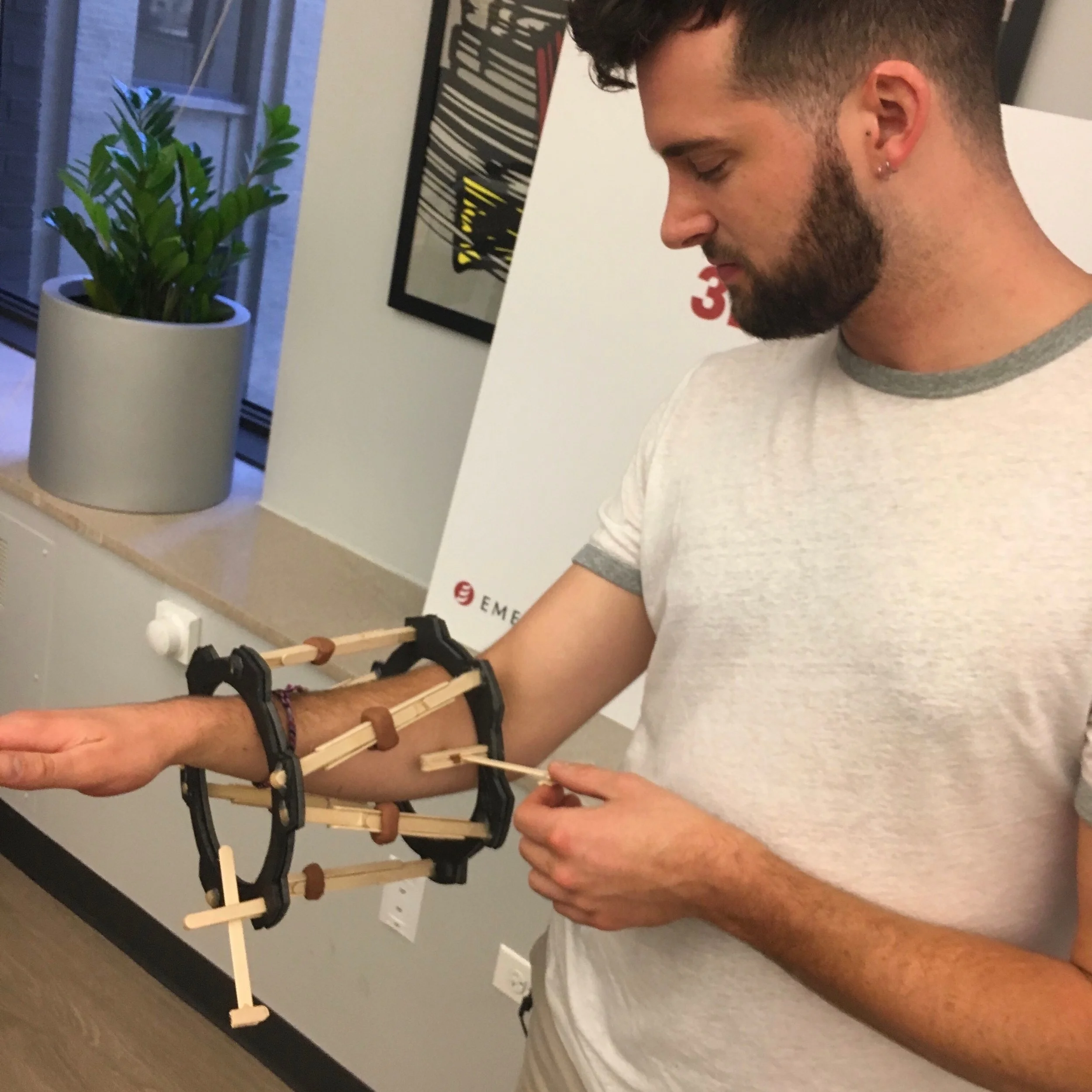
It was important for us to embody the experience of wearing the device.
We designed a physical mock-up of the device to understand constraints associated with mobility and to get a glimpse of the emotional fatigue that accompanies the wearable.
Takeaway: Wearing a fixator is “clunky” and limits mobility. To combat the emotional fatigue, the interface must be intuitive and touch targets large.
Market research
Competitor apps gave us a glimpse into where the market currently was.
In dissecting competitor apps, we realized that no version had struck a balance between being both comprehensive, and intuitive. There was obvious room for improvement.
Takeaway: Most competitors enable users to track adjustments, but lack the ability to record useful information about mood and wound care.
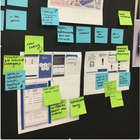
Concept sketching
We challenged ourselves to create three conceptually distinct concepts.
Ideas spanned from a fitness-app concept featuring a dashboard with patient progress, to a concept with a friendly illustrated character to lighten the feel of the app.
Takeaway: No one concept prevailed from our design studio, but elements from each design seemed viable, desirable and feasible.
Design
We cannot change our users’ situations, but we can optimize their in-app experience.
Let’s not overstep our abilities as designers. Empathic driven research showed that people wearing this device were in pain, and the notion of “resolving,” that would be inappropriate. Instead, equipped with a new understanding of our users, we set out to create a simple and intuitive experience that might be one less obstacle in the already taxing lives of our users.
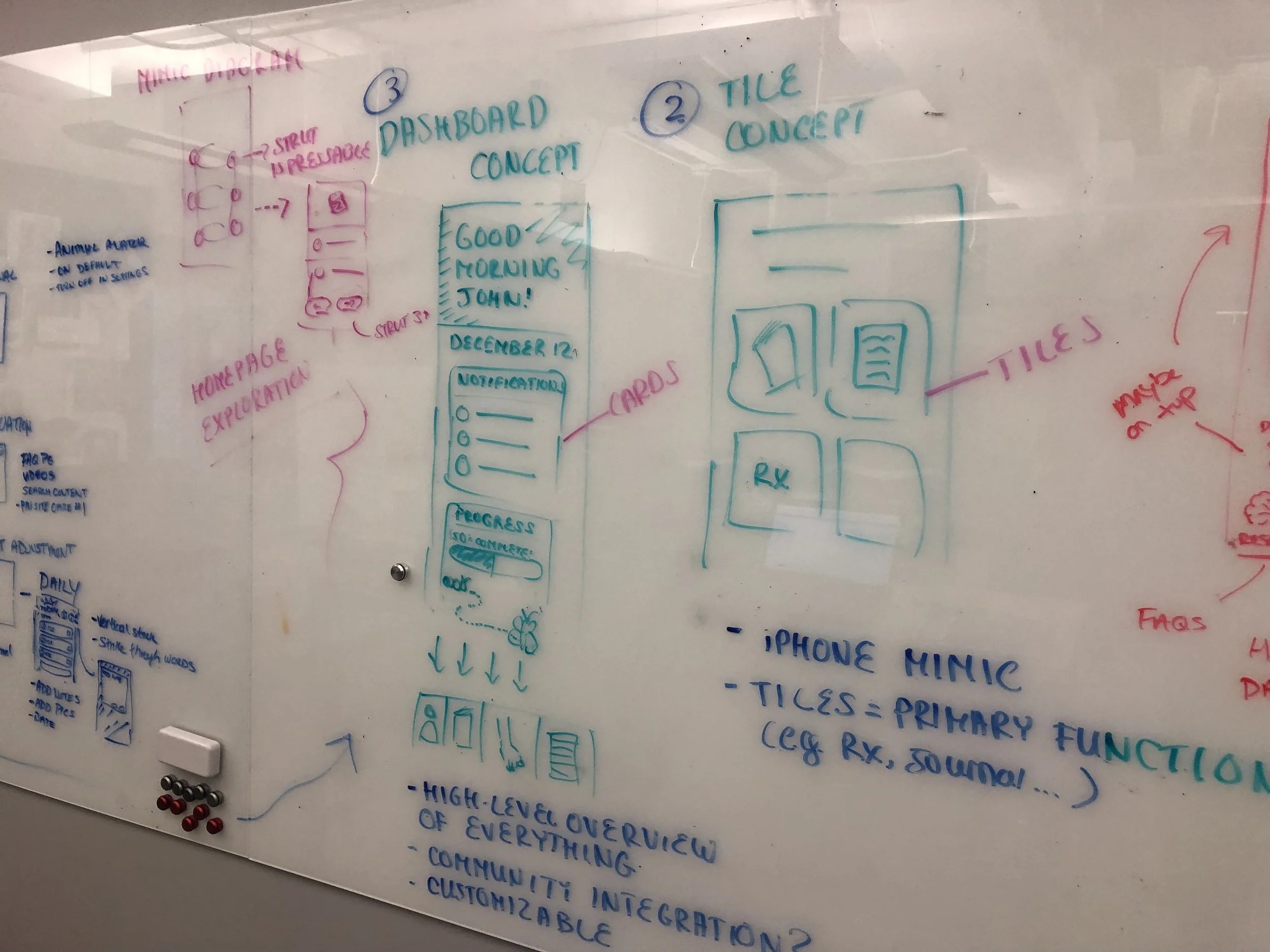
Three divergent concepts emerging from our concept session. We developed several screens into mid-fidelity wireframes for client review.
Feature Highlight
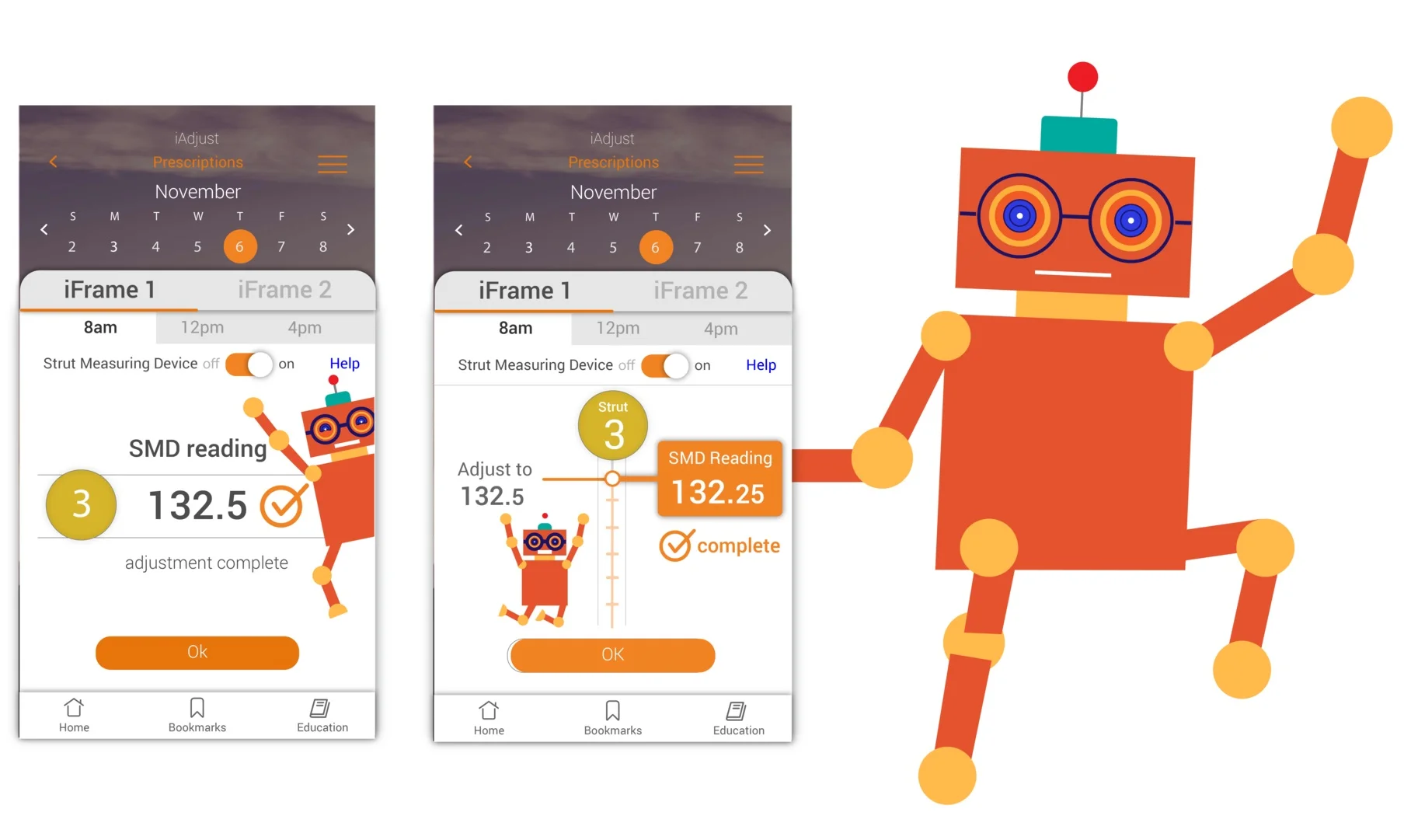
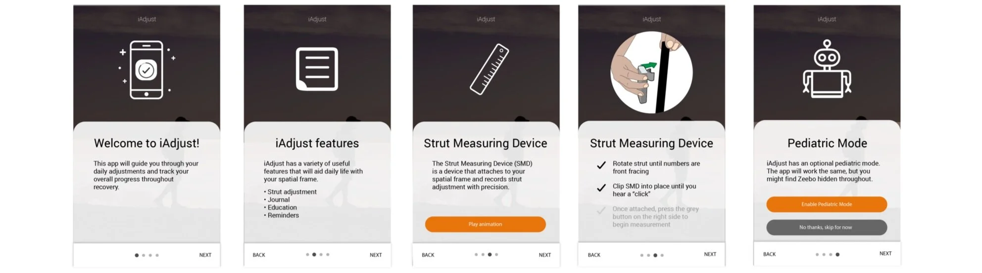
Our client was eager to pursue a pediatric version of the app. I developed a flat illustrated character, Zeebbo, to be infused into user flows.
Zeebo was developed as a distractor for parents making adjustments to small children experiencing discomfort. I used geometric shapes and a gender neutral character so that Zeebo could be dynamic in their movement and have a wide appeal.
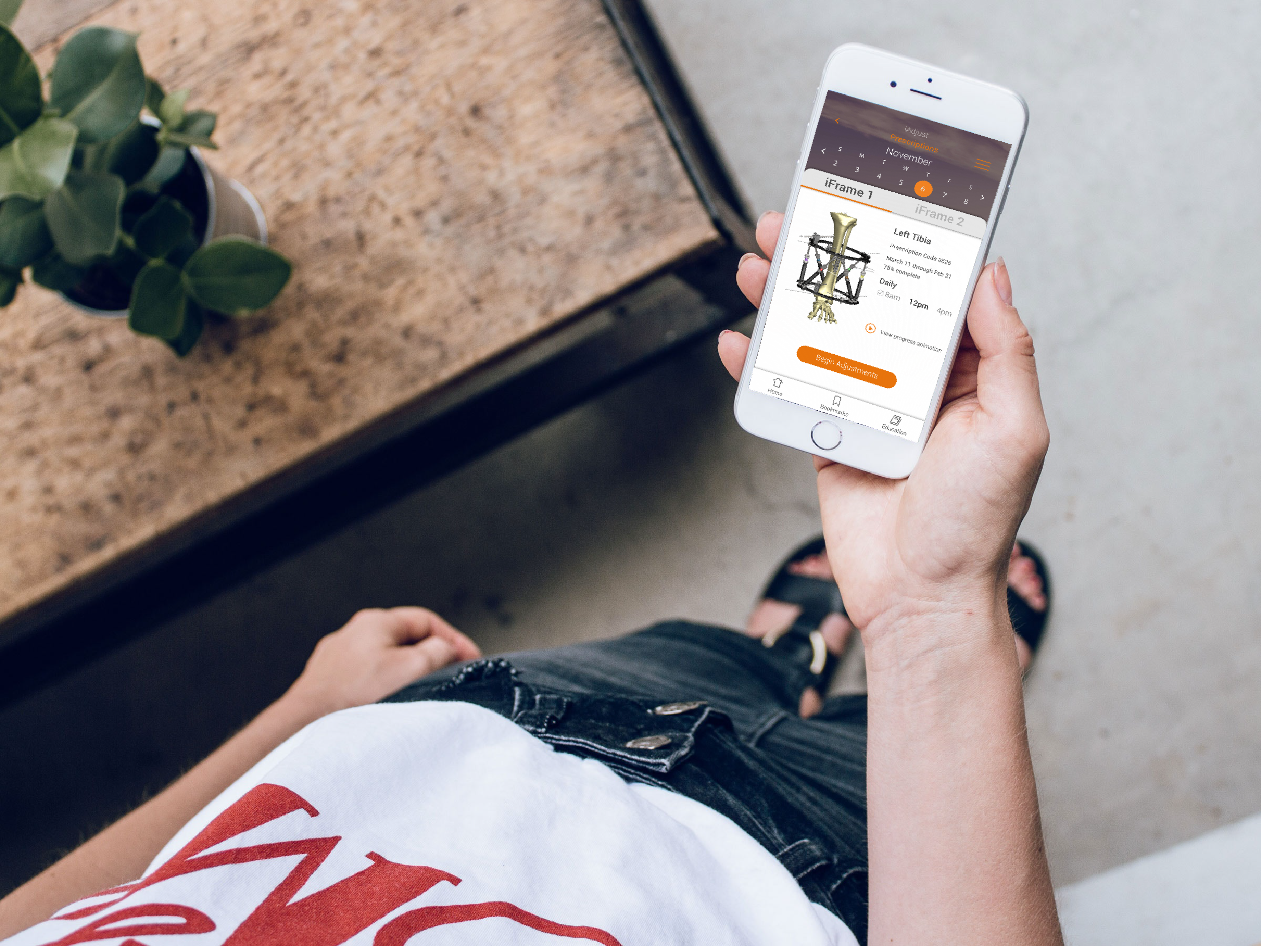
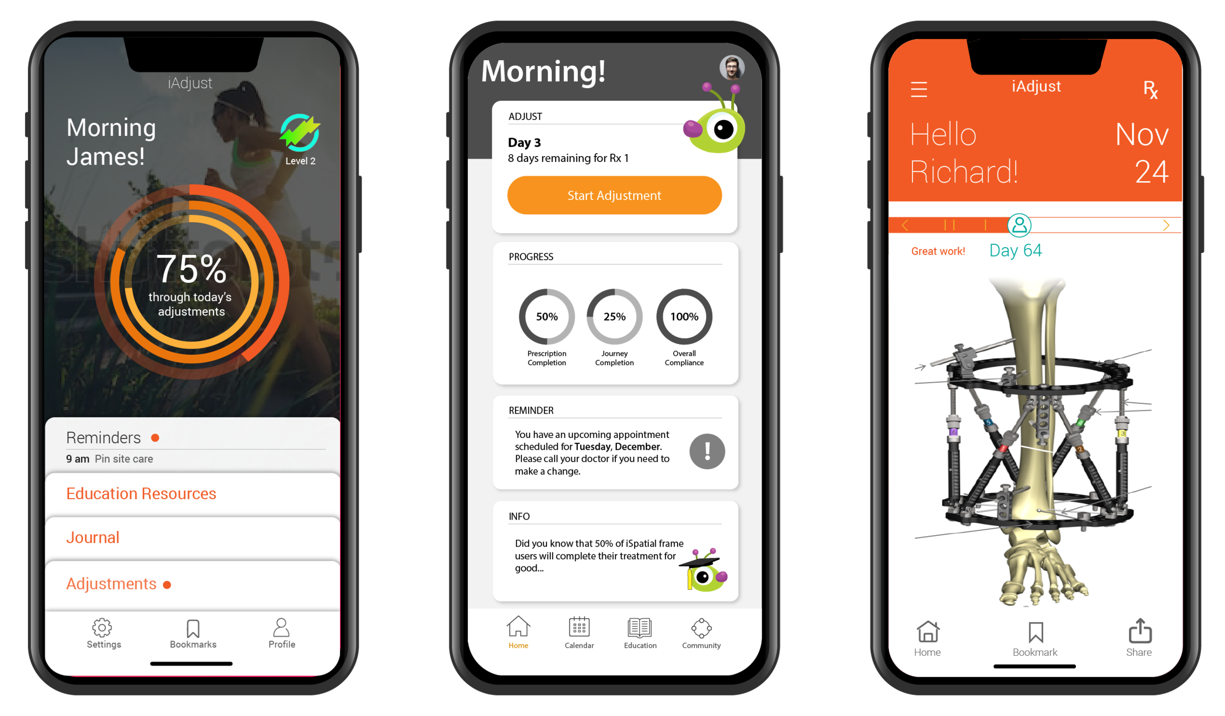
Users were eager to see their healing progress visualized within the app.
Usability testing showed that users appreciated having a sense of their recovery. However, a progress meter did not seem to capture healing in a meaningful or relatable way.
In response, we tested an animation showing bone realignment, empowering the user by showing them their physical transformation.
Users responded positively to the implementation, reporting that the visual representation of healing felt more motivating and less stagnant than a traditional progress meter.
Our client prioritized visibility of all unique in-app capabilities.
Encouraged by the reception of the pediatric mode and its selling point in the market, our client asked for increased exposure of those specific capabilities. I developed a “Product Tour,” to highlight the apps unique features. *Note, the client opted not to include a “skip,” button despite my encouragement and education around best practices.
Deliver
Our client ultimately decided on the fitness-app-inspired version. iSpatial directly addressed challenges through the following:
Simplistic - We created a straightforward and intuitive app focused on the primary workflows
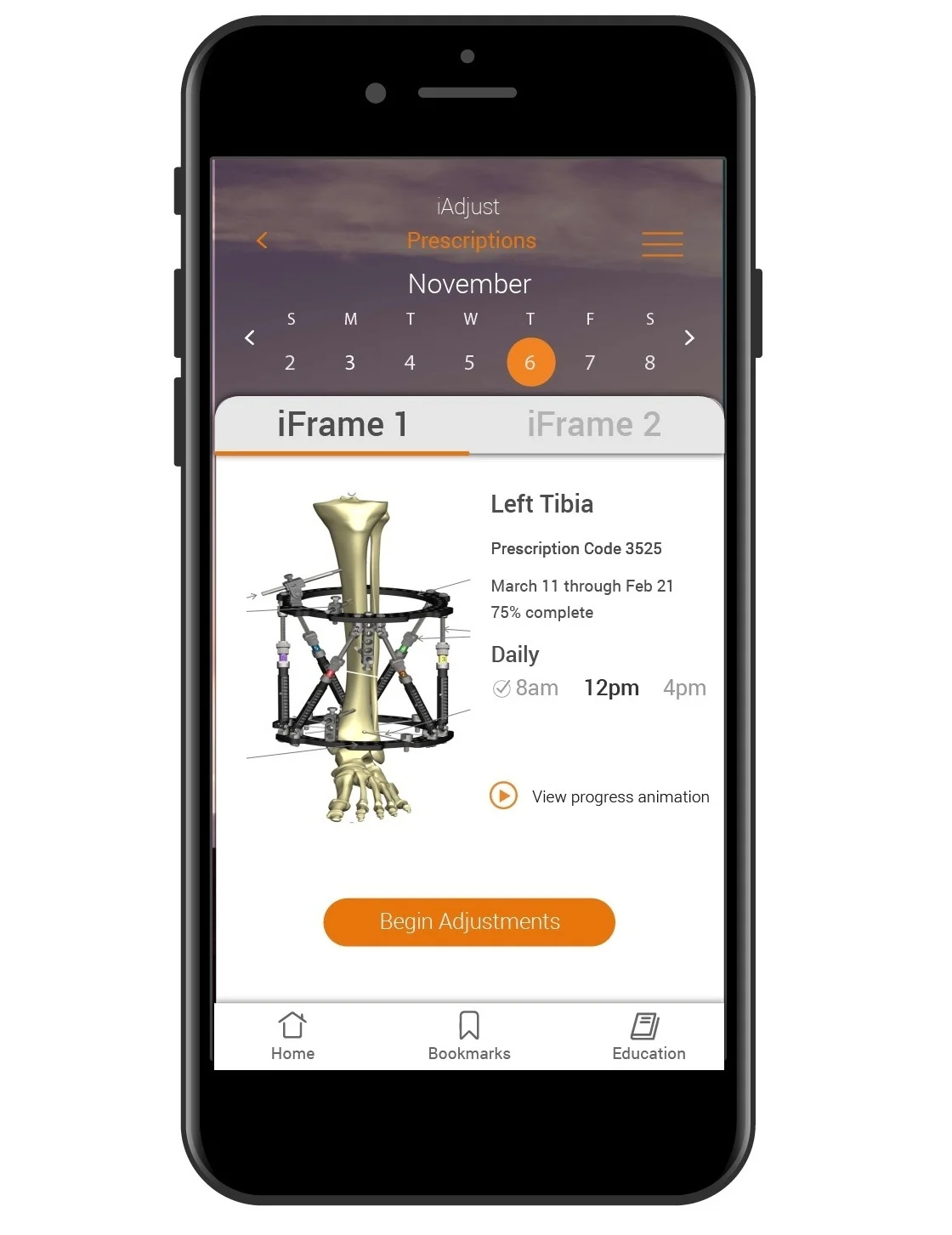
Comprehensive - In addition to logging daily strut adjustments, we provided features for documenting other valuable patient information including mood, wound care and diary entries.
Pediatric mode - We appealed to the caretakers of younger users through the implementation of a pediatric mode.
Lightweight - We designed a visually lightweight app that serves as a welcomed contrast to the heavy and bulky device.