Sample Processing UI
Hira is a device that prepares various types of samples for analysis. The device operates by taking a sample, processing it, and then distributing the sample onto a glass slide. Our team created the embedded graphical user interface which helps guide system operators as they prepare the sample.
Overview:
My role
UX/UI designer responsible for:
Design revisions
Illustrations
The Challenge
This is another project that I joined late in the project’s life-cycle. I immersed myself in the capabilities of the system and the existing design to get up to speed and become a valued contributor. As a supporting designer, I was challenged to:
Revise designs across the system based on client feedback
Create illustrations for various workflows throughout the system.
The Process:
Despite my late arrival to the project, I was still required to think critically about challenges associated with our effort. One such challenge was to create intuitive visuals for the small screen (3.5” x 6”).
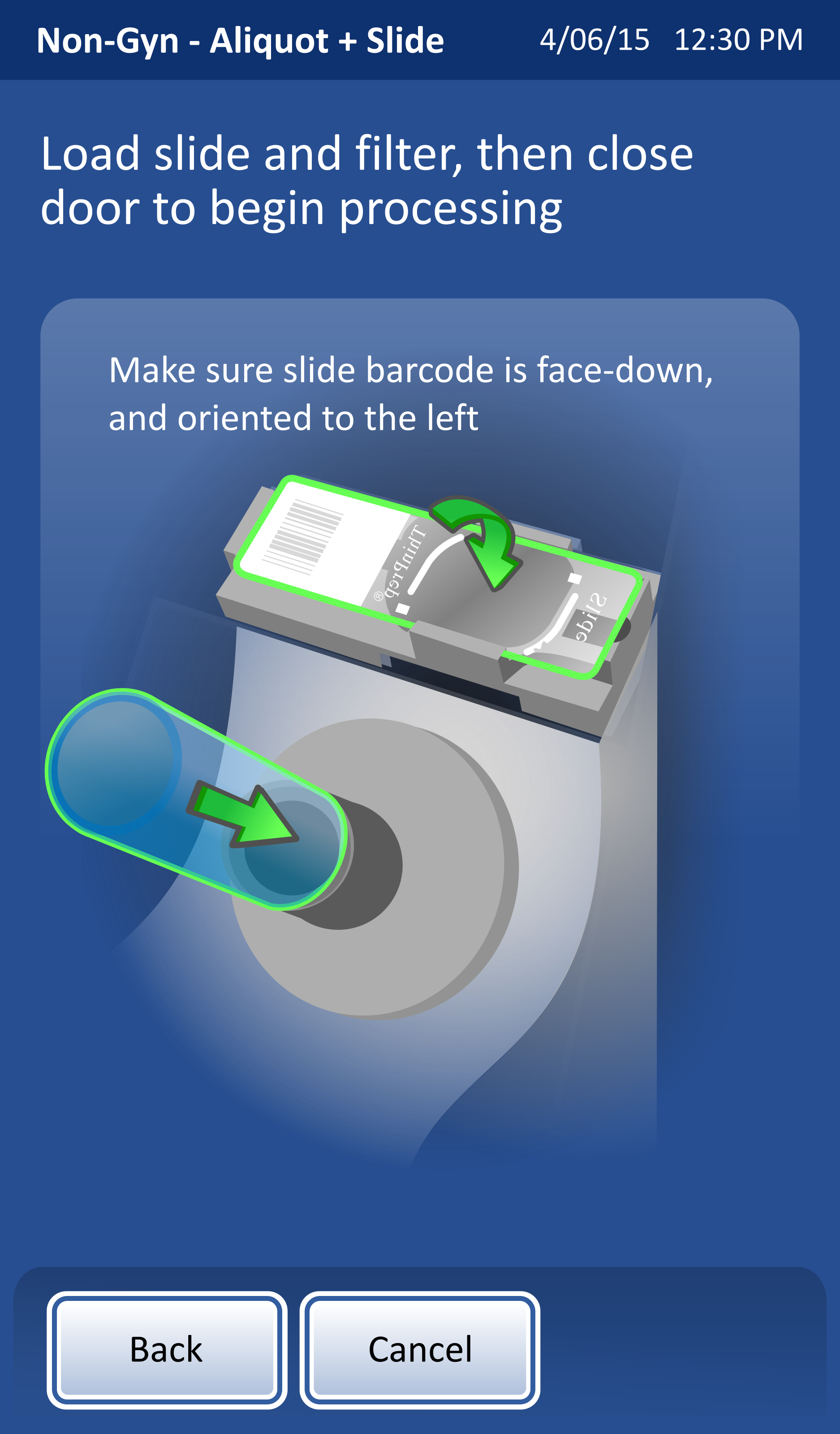
Usability tests showed that users were incorrectly completing a crucial step to load the slide and filter in the correct orientation. I was asked to present several variations of the illustration that would reduce confusion and result in the step’s proper completion.
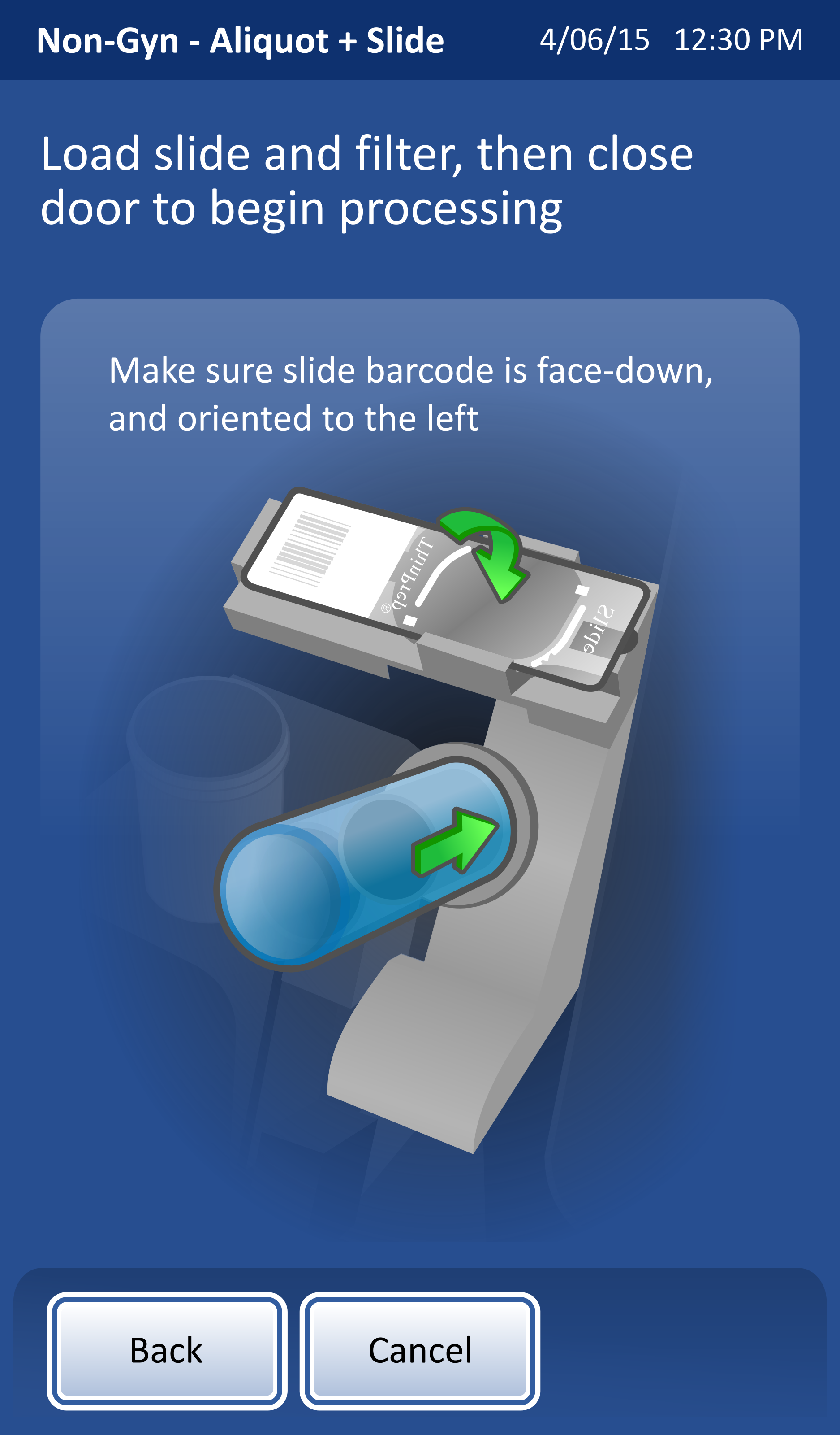
Original
The original clearly conveys users’ confusion associated with loading the slide and the filter. I was motivated to create three distinctly different variations.
Split Screen
I created a split screen version to clearly separate the two steps visually. While the separation was clear, I worried that the illustrations lacked context in not showing a larger part of the system.
Highlights
Adding bright green highlights provided another element of visual distinction, however, it was not drawing enough attention to the separation and the order of the steps.
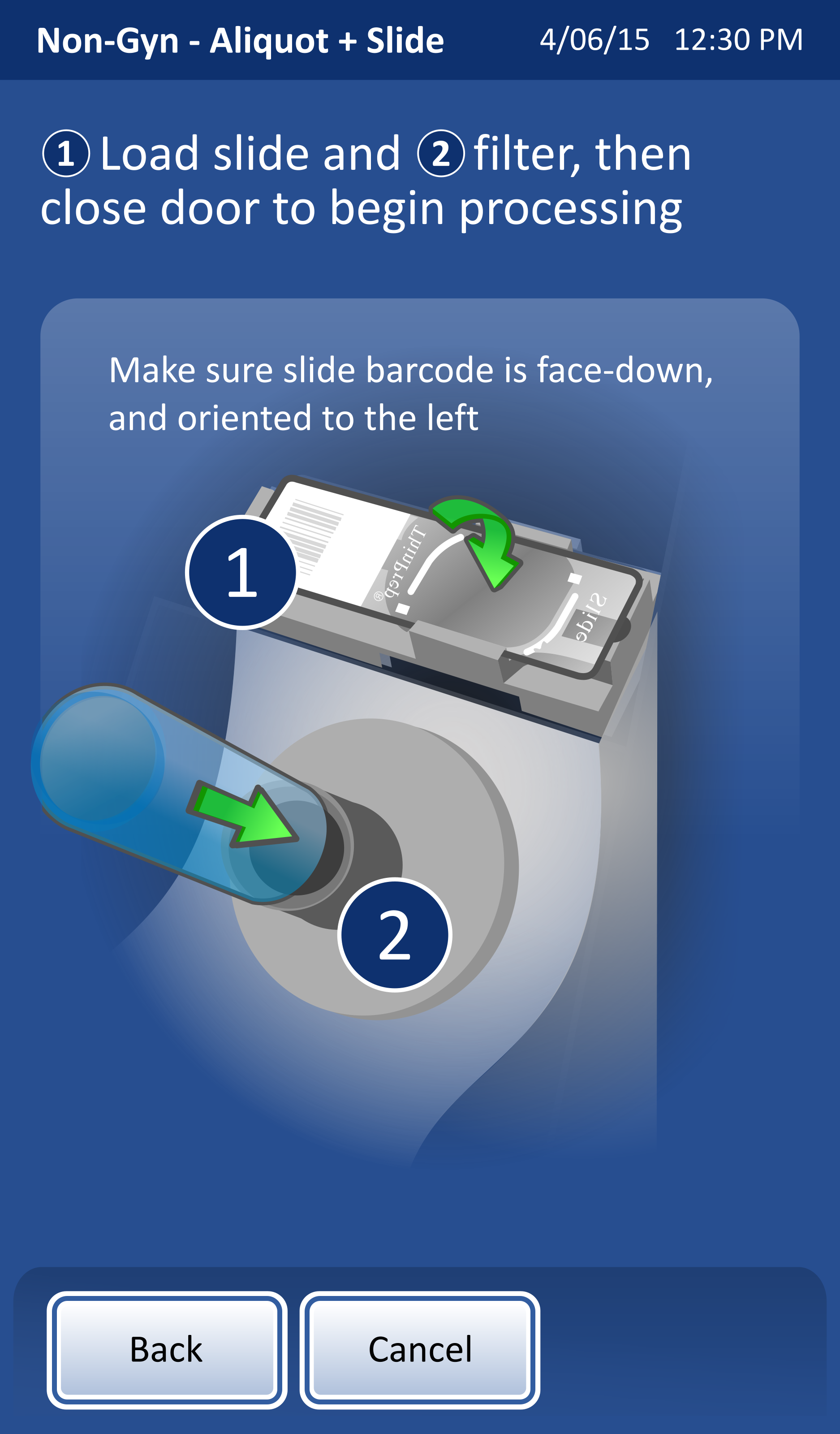
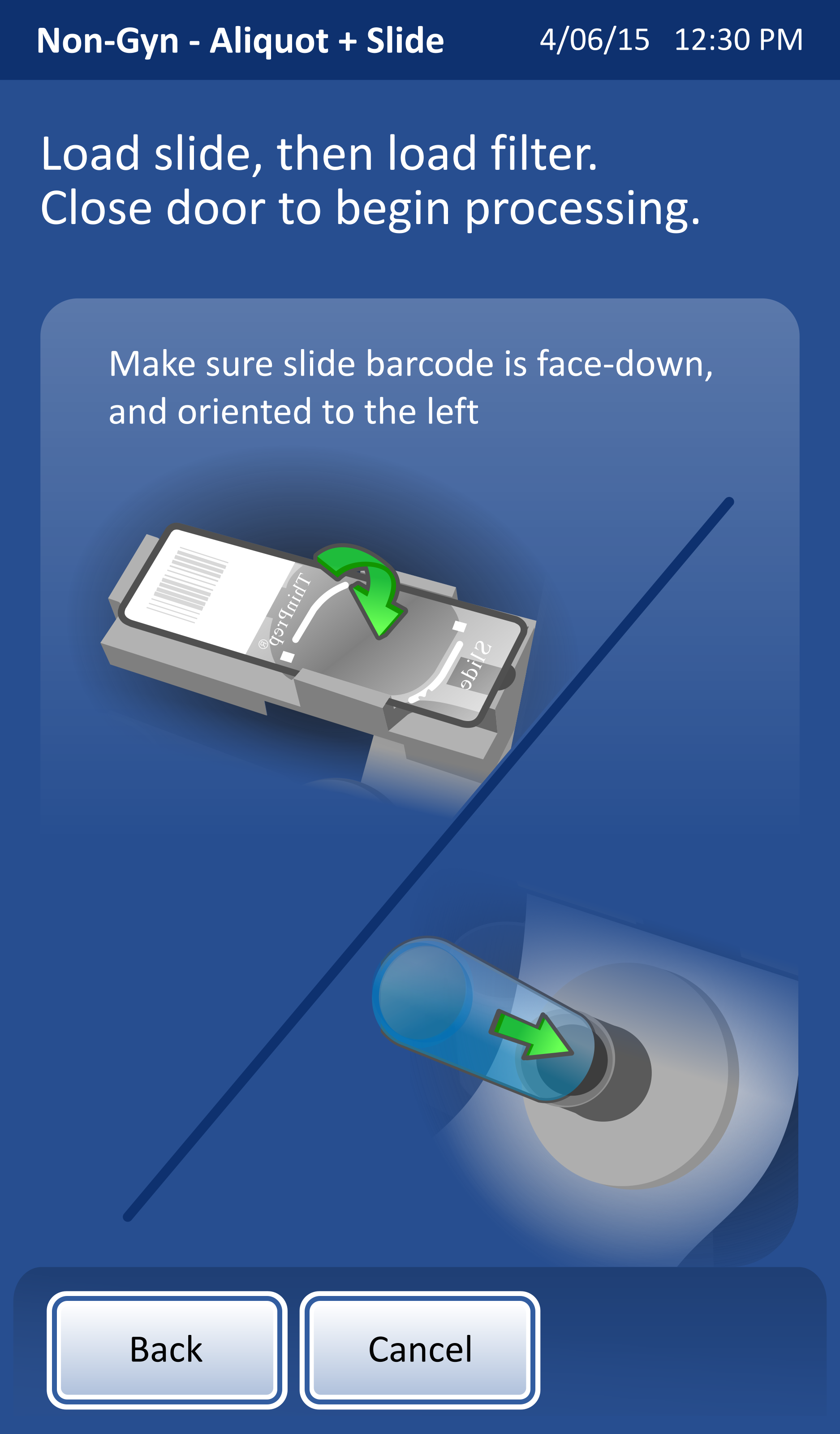
Numbering
I finally landed on numbering, which clearly linked the description to the illustrations. The numbers within the illustration also added emphasis without overly cluttering the image.
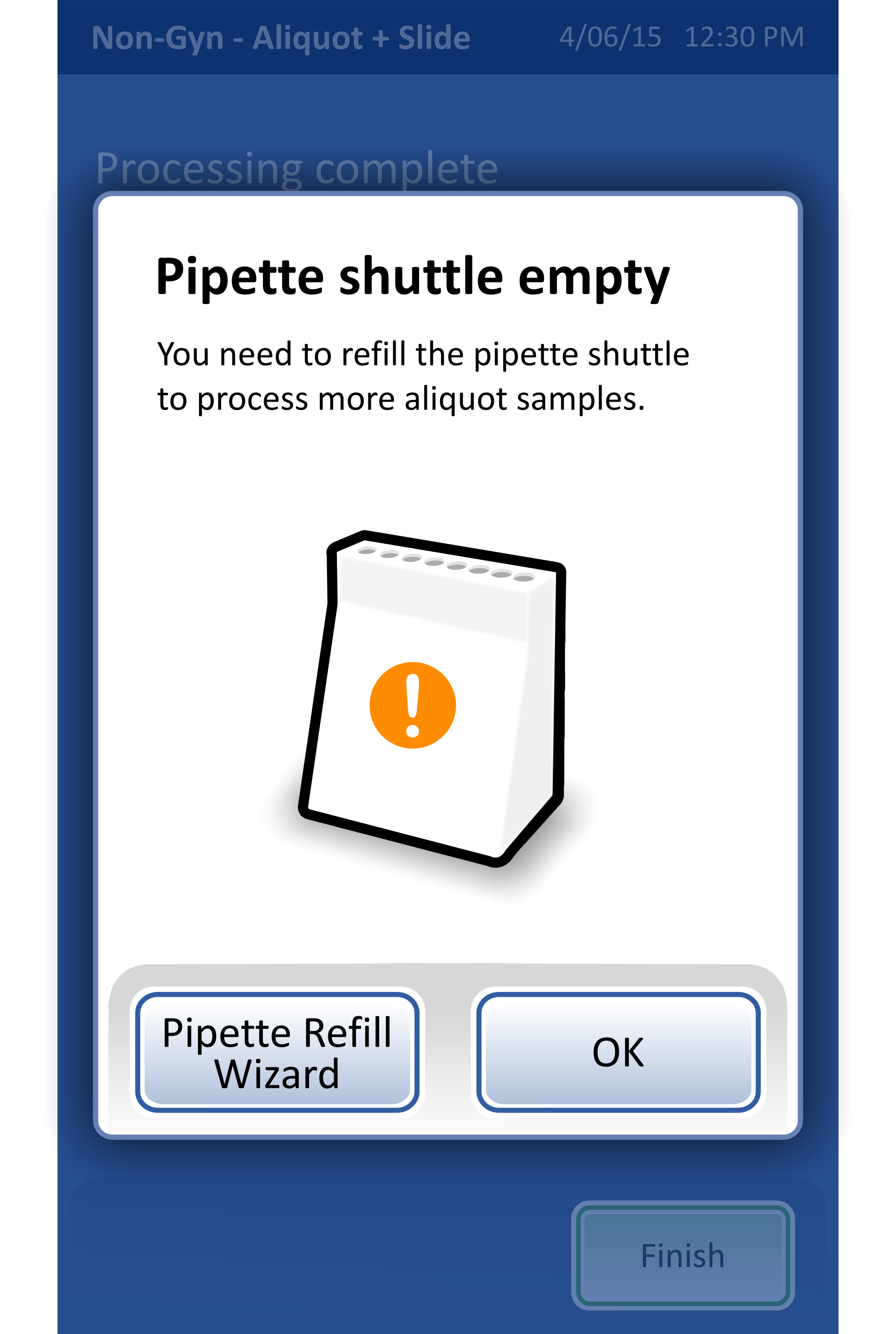
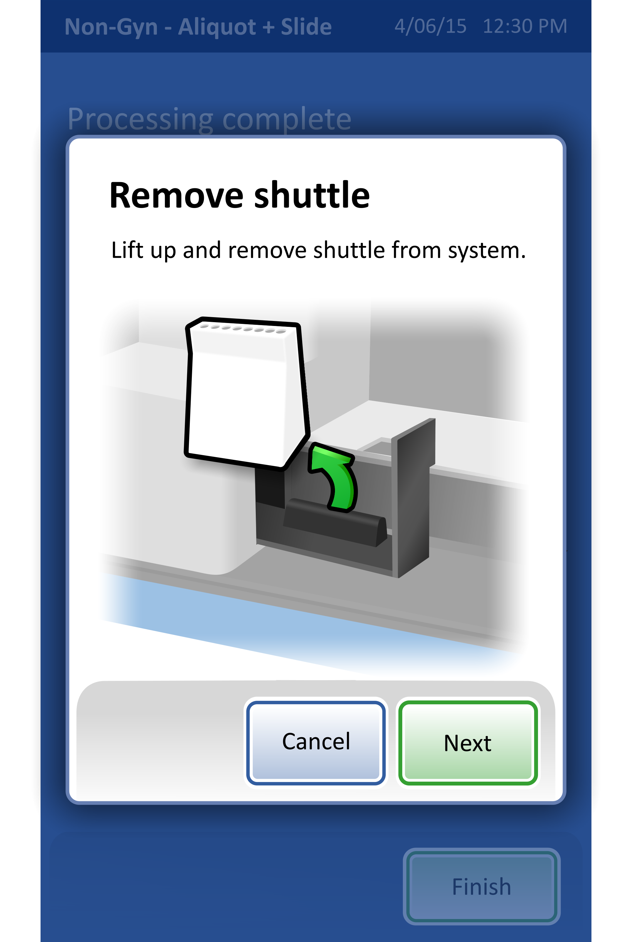
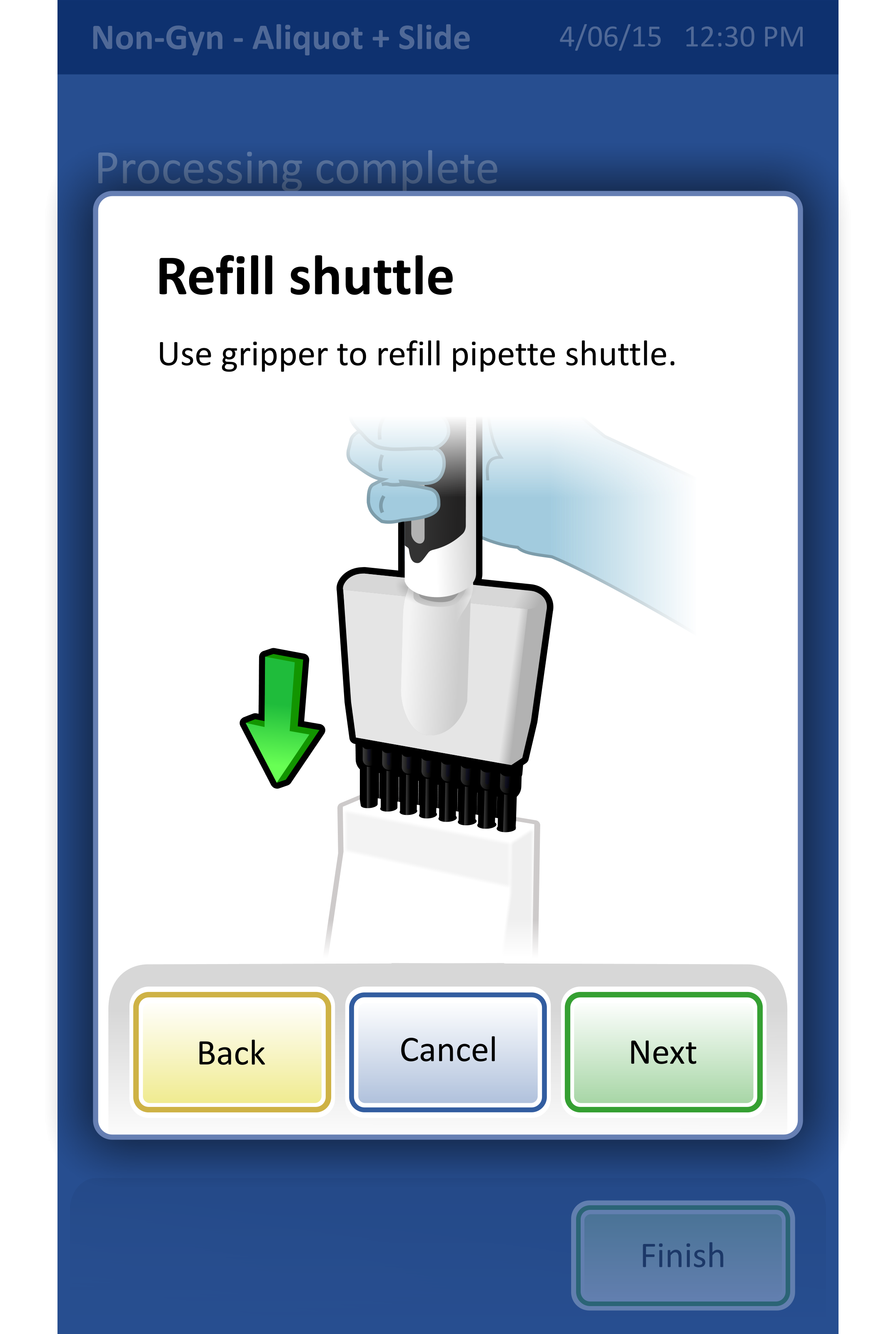
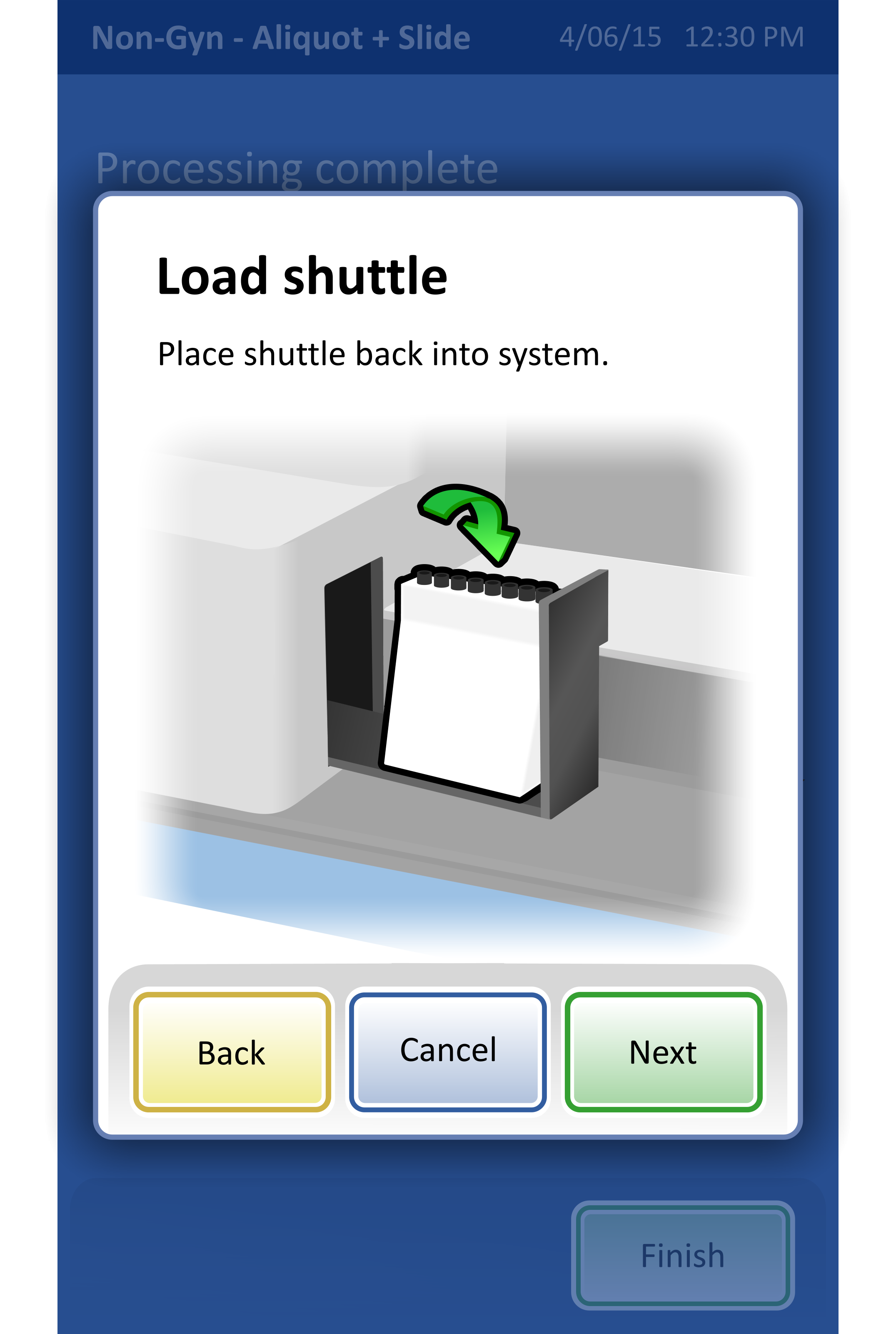
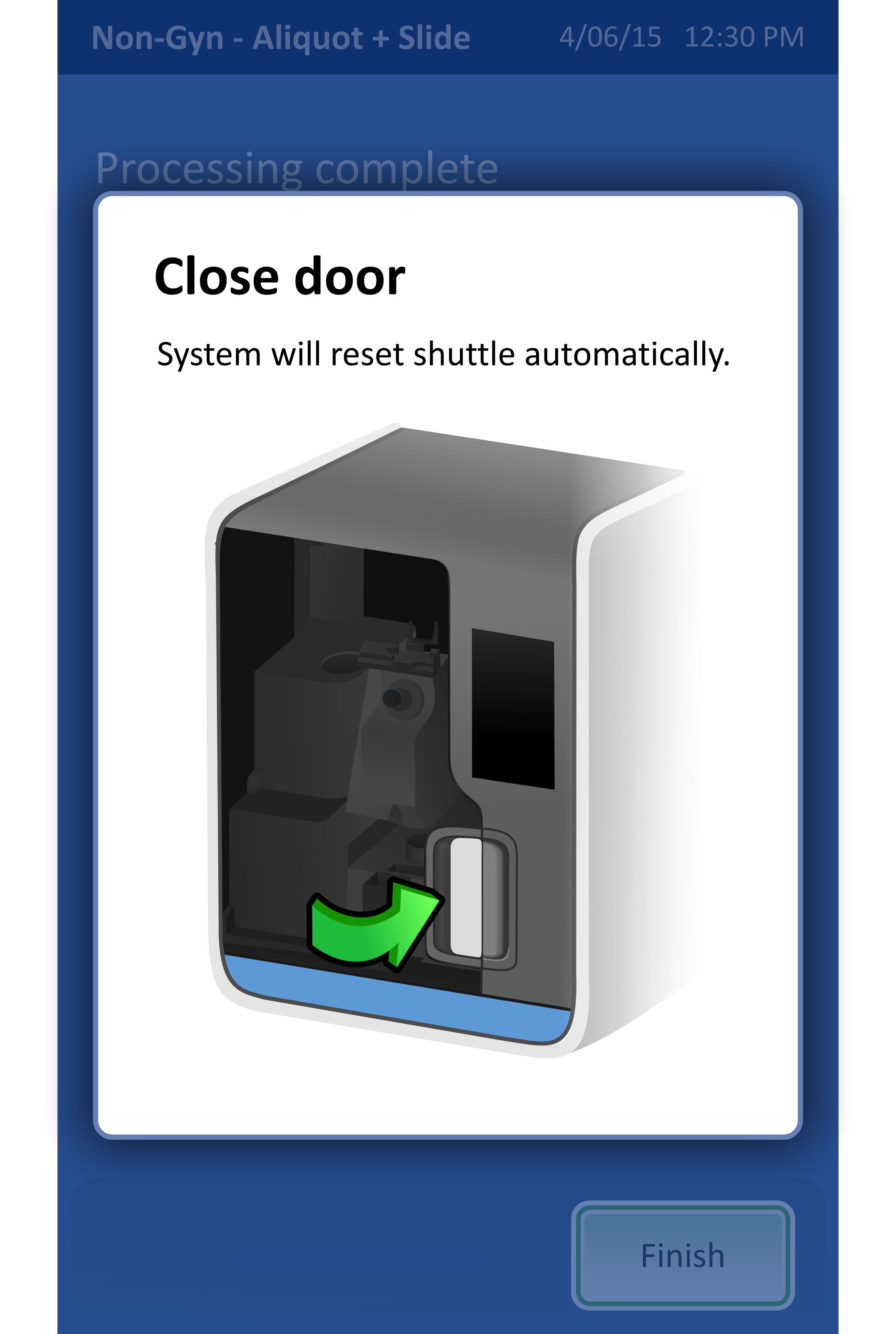
Pipette replacement
I was also asked to create a workflow for replacing pipettes in the system, a standard practice that happens when the system has been running for awhile.
At the time, there was no template for wizards so I took some creative liberty in defining a wizard style that looked cohesive with the remainder of the UI. I decided on a high contrast dialog with clear visual hierarchy, large navigation buttons, and clear illustrations.
All of the illustrations shown in the workflow are my own.
Lookback:
Despite joining this project late, I became a valued contributor by delivering illustrations, secondary workflows, and revising previous designs based off of usability feedback.
Illustrations - Not only did I have to create illustrations that matched the illustration style of those done previously, I also had to alter illustrations so that they more clearly conveyed text instructions.
Secondary Workflows - While I was not involved in the creation of the primary workflow, I did work independently on secondary workflows, including the pipette replacement workflow. These workflows, while performed more rarely, are still vital in the successful operation of the system.
Usability feedback - This project was being completed in succession with summative testing. I was able to see firsthand the types of feedback users were providing and then brainstorm and implement creative solutions.