Surgical System Redesign
Plexus is a surgical instrument company seeking to combine multiple generations of an eye surgery system. Previously, each device could only perform a single procedure type. The new system must seamlessly accommodate both procedure types.
My role
User Interface Designer / UX Researcher responsible for:
Early-stage research
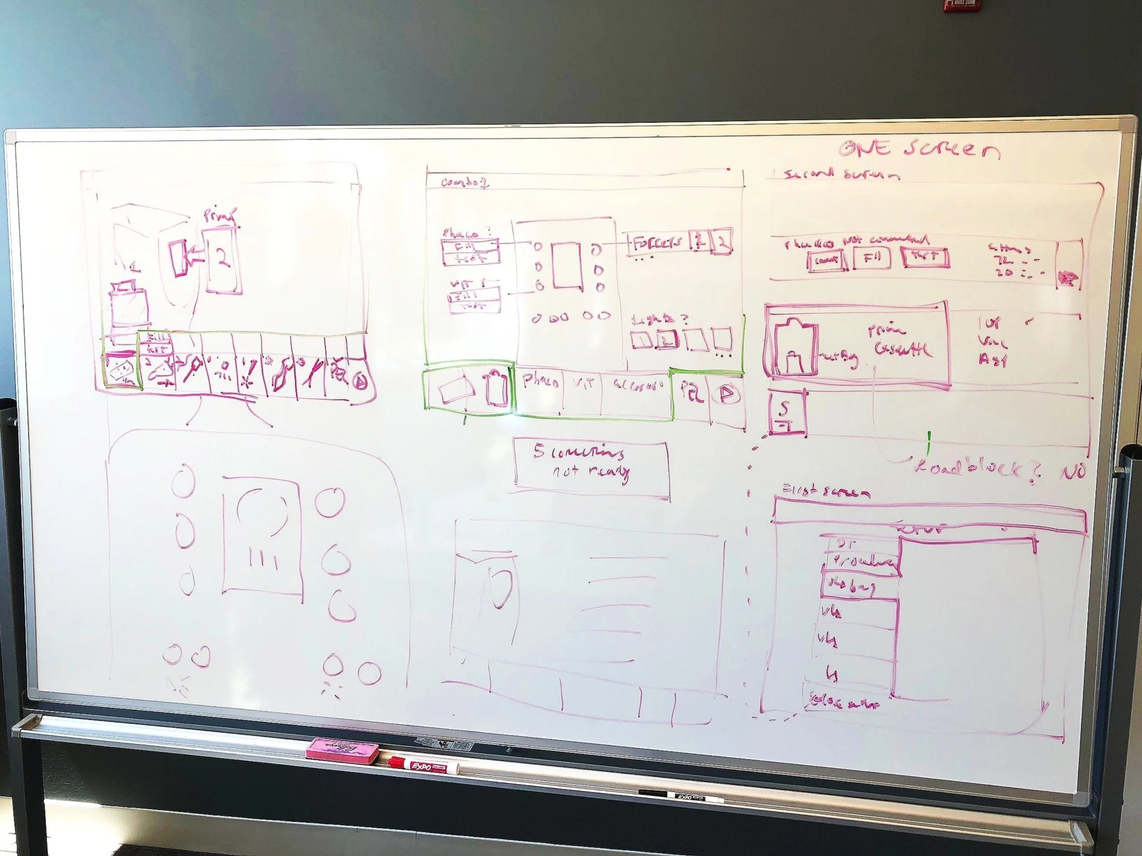
Concept sketching
Wireframing
User interface design
Branding + Style exploration
Prototype development
Supporting client communication
The Challenge
Our client challenged us to consider the following:
How might we standardize patterns and UI elements across different work flows?
How might we get buy-in from users that have been using the same product for a decade?
How might we create a product that looks and feels relevant and also timeless?
Discovery
Surgeons are not even looking at the device.
Our client informed us that surgeons represent “primary users,” as the main operators of the surgical system. Heuristic observations revealed otherwise.
Scrubbed into surgery, our teammates gleaned a surprising insight - though surgeons occasionally glance at the screen for information, it’s the nurses who directly manipulate the interface. This encouraged us to expand our interview pool.
Our global team completed:
30 interviews
Targeting nurses, scrub techs and surgeons, across...
4 countries
To validate that user behaviors were cross-cultural.
I was heavily involved in the creation of a customer journey map to synthesize qualitative data about persons involved in the patient’s pre-operative assessment, surgery, and post-operative care. I also supported the visual treatment and iconography of the map.
Key findings identified through the customer journey map include:
Software systems used to track patient information pre and post operatively are disjointed and require repeated actions.
There is minimal procedure setup guidance in existing user interface which leads to confusion.
Earning trust from users required subject matter expertise.
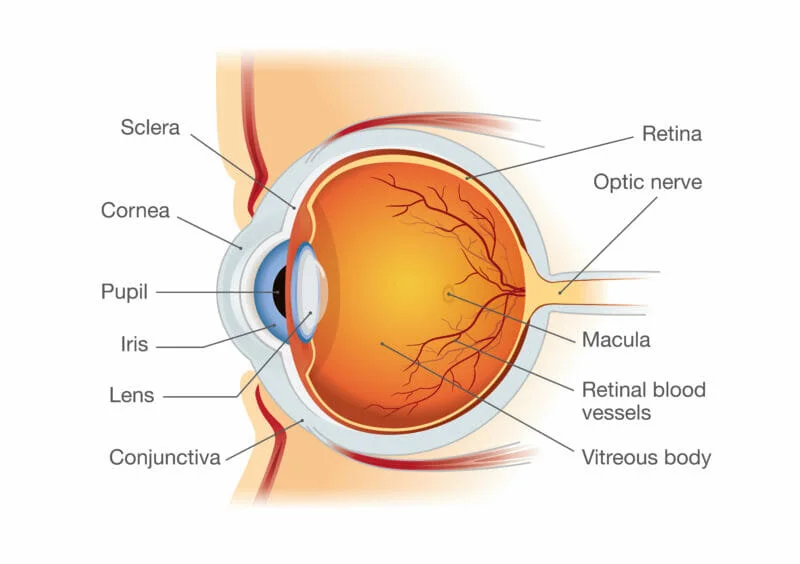
To generate trust from change-averse users required that we elevate our knowledge of both the device and the procedure. We spent weeks pouring through dense user manuals, diagramming existing screens and learning about the anatomy of the eye.
Seasoned surgeons were surprised by our investment in the design effort and more agreeable to alternate design exploration.
Design
Our client was engineering world-class hardware. They wanted the same “feel” in software.
The client cited Apple and Tesla as design inspiration. Considering the product would not be released until 2022, they needed a design that would be timeless and relevant for years to come. This inspired dark palettes, and semi-skeuomorphic elements.
As a further exercise to help blend two systems with different identities, we involved the client in landing on a design language and exploring how the hardware could influence our interface.
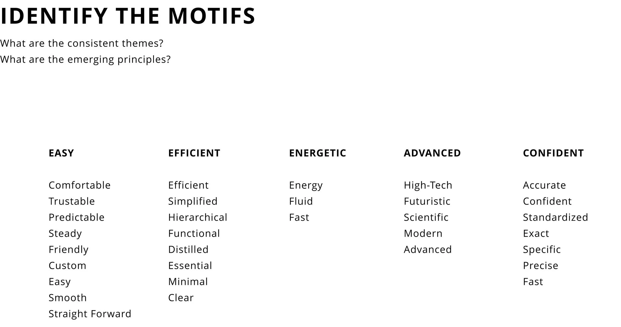
Design Language
Aligning on a design language was an important step for establishing direction for product development.
We mapped some of the words we had heard from the client and explored visuals associated with these descriptors. These “motifs,” would inform divergent concepts.
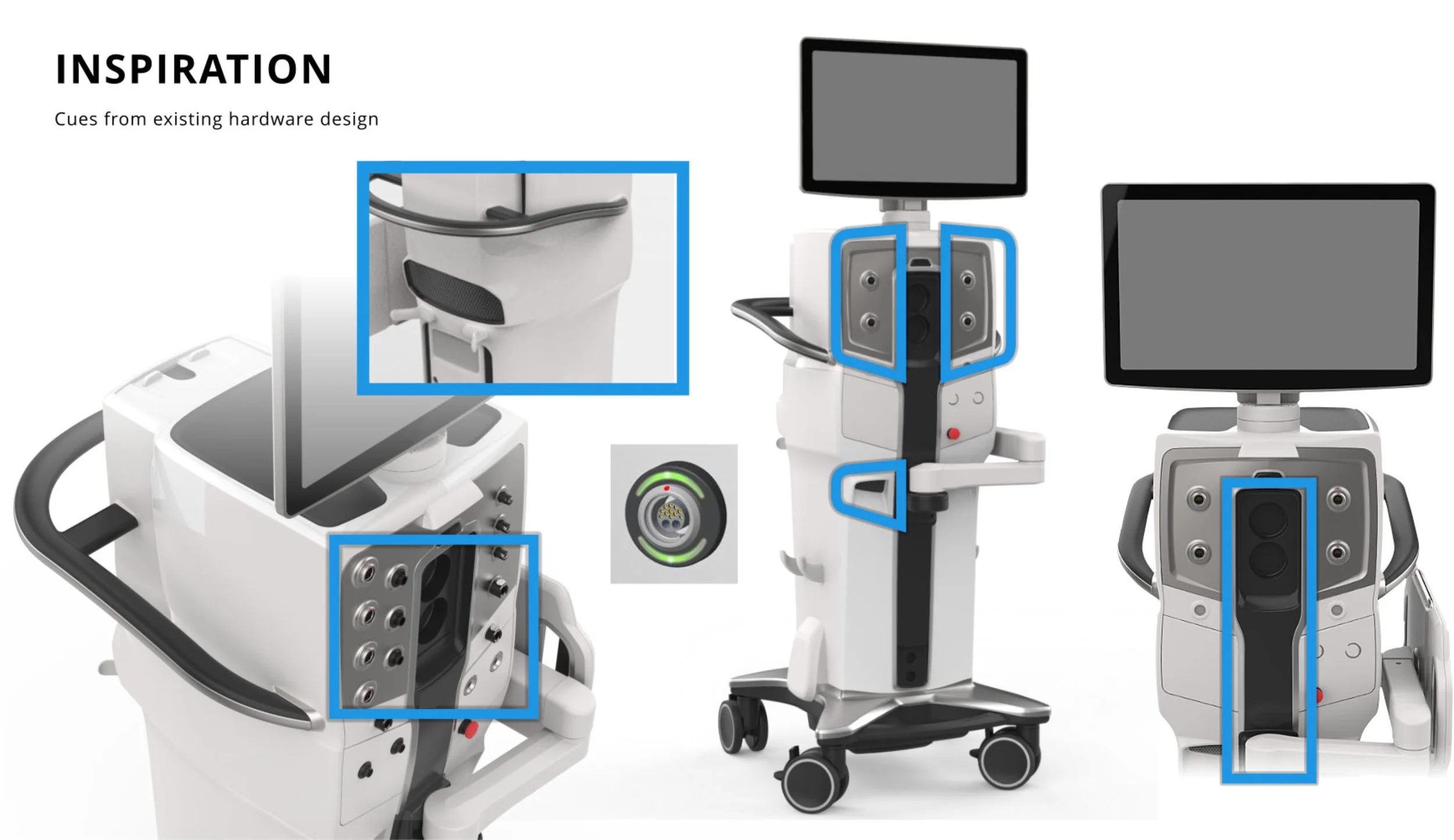
Hardware
Though our team was not leading hardware design, we took inspiration from the device’s form and infused it into the UI.
The curvature of the systems mid-section, for example, found its way into the navigation bar of the GUI. The winged electrical panels also inspired similar shapes.
Motif-Driven Concepts
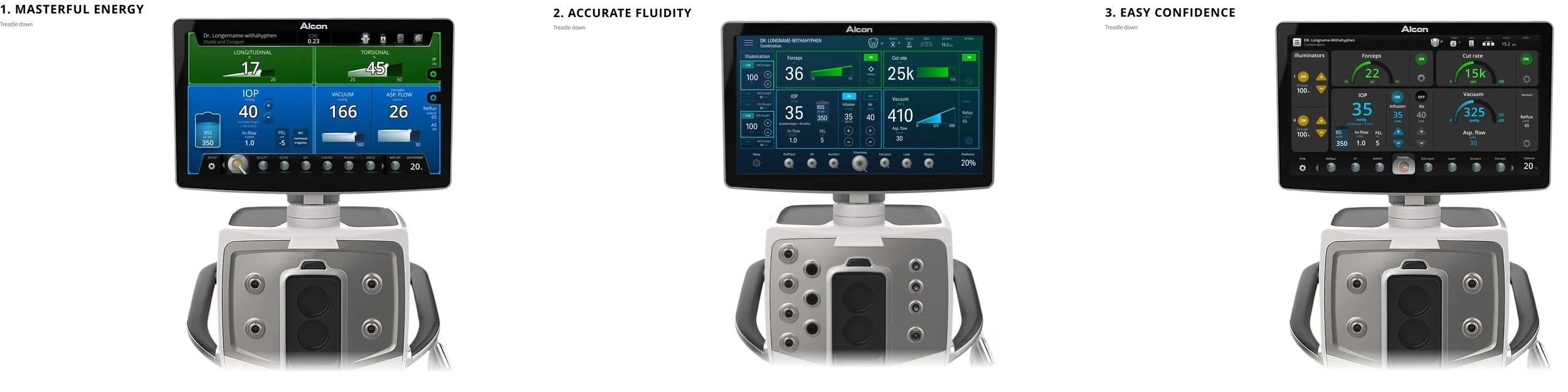
Three divergent concepts presented to the client as high-fidelity wirefames.
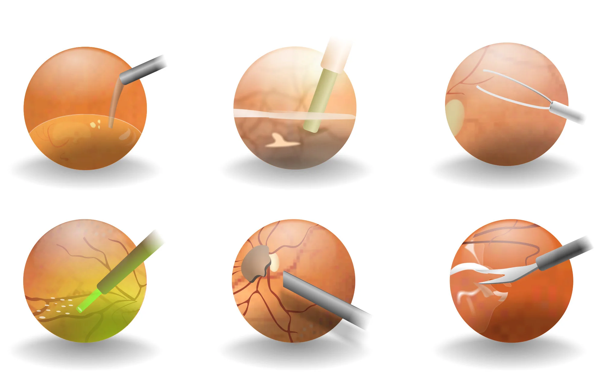
Surgeons love the animated eye gifs in the navigation, but they’re dated.
Feature Highlight
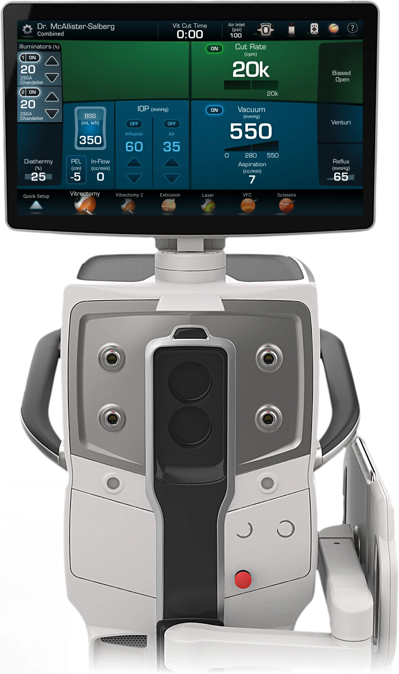
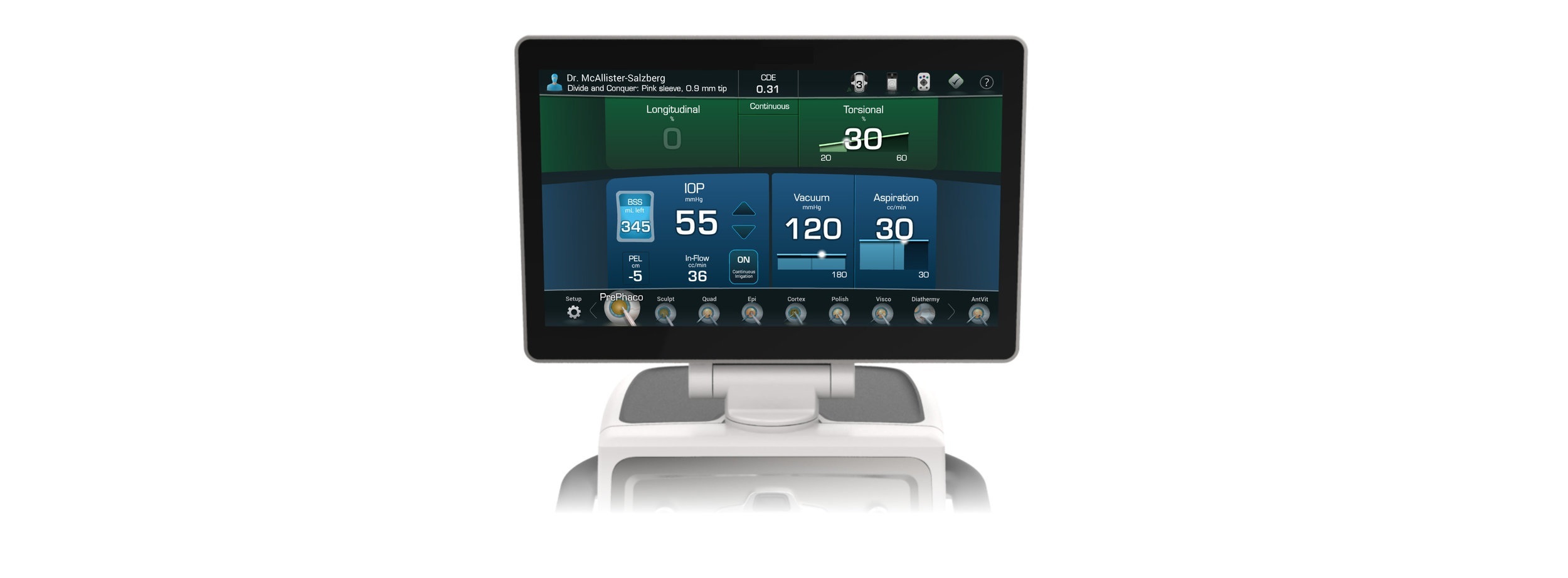
Plexus’s old systems suffered from dated eye illustrations, which are selected to navigate through the procedure. I created new, modern icons inspired by the predecessors.
I used a semi-realistic illustration style to capture the details of the eye and added more colors saturation and shadows to ensure the eyes would “pop,” against the dark background.
The solution:
The careful planning and deliberation with which we approached this project paid off as we neared final rounds of the design. Stakeholders were impressed with our expansive knowledge of the system, and our understanding of technical details. Here are some items that made our design successful:
Consistency - in combining two systems, we chose to stick to one grided layout which would adapt according to the procedure and step. Stakeholders on both sides appreciated the cohesive look across multiple procedures.
Modernized style- after exploring countless UI skins, we landed on a UI that incorporates modern flat design with slightly more rendered elements. The balance of these design styles ensures that the device fits within the medical market but has enough unique features to allow it to pique interest.
Human factors - HFE was at the core of every design decision. Both cataract and vitrectomy surgeries are high-stake procedures. It was crucial that design decisions be informed and backed by human factors principles. These manifested visually through the use of high-contrast screens, large type and intuitive workflows.